29 Red Living Room Ideas That Bring Bold Style Into Any Home
Red gets a bad reputation in home decor, and honestly, it’s undeserved. After years of helping homeowners pick paint colors and style their spaces, I can tell you red is one of the most rewarding colors you’ll ever work with. It’s warm, it’s confident, and it photographs beautifully in every kind of room, whether you’ve got a cozy 200 square foot reading corner or a sprawling open-concept living area. The trick isn’t avoiding red because it feels “too much.” The trick is knowing which shade of red to use, how much of it to use, and what to pair it with so the room feels intentional instead of overwhelming. In this guide, I’m walking you through 29 completely different red living room ideas, covering small apartments, mid-size family rooms, and large open layouts, so no matter what you’re working with, you’ll find a direction that fits your space and your personality.
29 Red Living Room Ideas
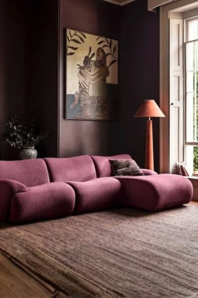
1. Deep Maroon Color-Drenched Cocoon
This idea is all about wrapping a small living room in deep maroon from floor to ceiling, including trim and even the ceiling itself. Instead of fighting a small space, you lean into it, creating a warm, enclosed, cabin-like feeling that makes the room feel intimate rather than cramped.
Why it works
Small rooms often look awkward when painted a pale neutral because the contrast between wall and trim draws attention to how tight the space actually is. Color-drenching in maroon removes that contrast completely, so the eye stops measuring the room and starts feeling it instead.
Best for
Small living rooms, dens, or reading rooms that don’t get a ton of natural light anyway.
Styling Tips
Stick to one shade of maroon on walls, trim, and ceiling. Bring in brass or warm wood furniture to keep it from feeling like a cave, and add a single statement lamp for soft ambient light in the evening.
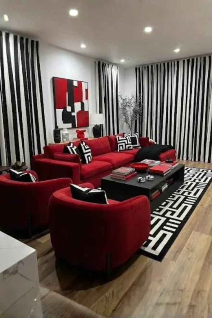
2. Red Velvet Sofa with Black & White Base
Here the red sofa is the hero, sitting inside a crisp black-and-white room. Everything else, the walls, the rug, the curtains, stays neutral so the velvet sofa gets to be the showstopper.
Why it works
Keeping the background simple lets one bold piece carry all the drama. It’s a classic designer trick: pick one statement item and let everything else support it quietly.
Best for
Mid-size living rooms in apartments or townhomes where you want a modern, slightly glam look without repainting walls.
Styling Tips
Choose a velvet sofa specifically, since the texture catches light and makes the red feel rich rather than flat. Add black piping or black-framed art to tie the palette together.
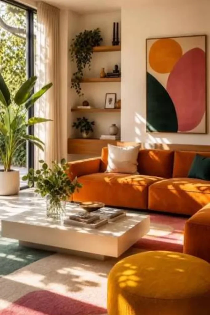
3. Terracotta Red Earthy Living Room
This look uses warm, brownish reds like terracotta or rust instead of bright fire-engine red. Think sun-baked clay tones paired with natural materials.
Why it works
Earthy reds feel grounded and calming rather than energizing, which makes them much easier to live with day to day. They also pair effortlessly with wood, rattan, and linen.
Best for
Living rooms with a lot of natural wood flooring or exposed beams, and for people who want warmth without intensity.
Styling Tips
Layer in jute rugs, woven baskets, and linen throw pillows. Avoid anything too glossy here; matte and textured finishes keep the earthy mood intact.
4. Red Accent Wall Behind a Neutral Sofa
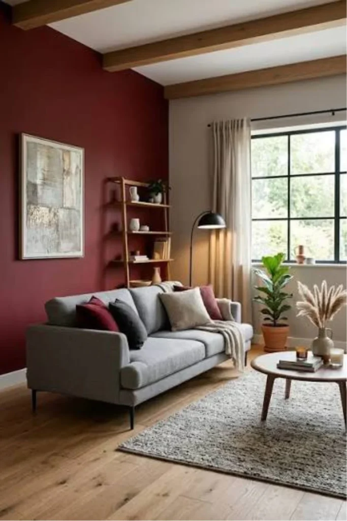
A single wall painted red, usually the one behind the main seating area, while the rest of the room stays neutral. This is the most beginner-friendly red idea on this entire list.
Why it works
One wall gives you all the personality of red without the commitment of an entire room, and it creates an instant focal point behind your seating.
Best for
Rentals, first-time red users, or anyone nervous about going too bold too fast.
Styling Tips
Pick the wall your eye lands on first when entering the room, usually the one behind the sofa or TV. Keep furniture neutral so the wall does all the talking.
5. Bold Red Wallpaper Statement Room
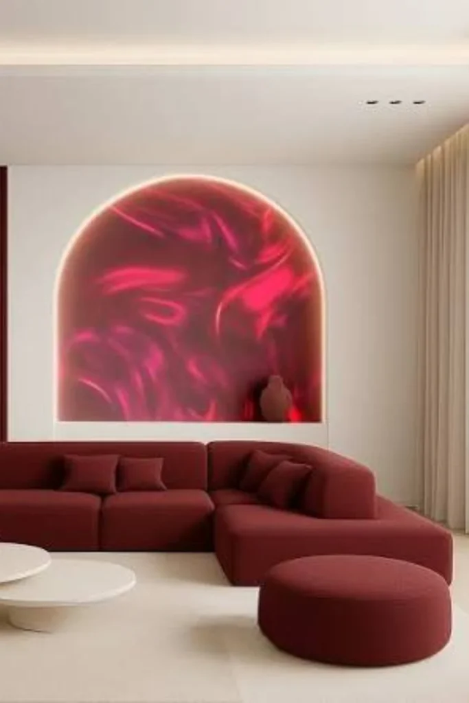
Instead of flat paint, this idea uses a red wallpaper with a pattern, whether that’s a damask print, a botanical motif, or a graphic geometric design.
Why it works
Pattern adds depth and movement to red in a way that flat paint can’t, so the color feels layered and intentional instead of like a single block of intensity.
Best for
Formal living rooms or entryway-adjacent living spaces meant for entertaining guests.
Styling Tips
Use wallpaper on just one or two walls if it’s a busy pattern. Pull one secondary color from the wallpaper print and repeat it in your cushions or curtains.
6. Red and Gold Glamour Living Room
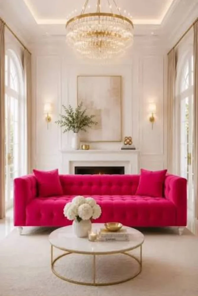
This is a large, open living room dressed in deep red upholstery, gold hardware, brass lighting, and a touch of mirrored or marble detailing throughout.
Why it works
Gold has a way of softening red’s intensity while amplifying its richness, creating a regal, hotel-lobby kind of atmosphere that big rooms can really show off.
Best for
Large, open-concept living rooms with high ceilings, especially in homes that lean traditional or transitional.
Styling Tips
Use gold sparingly, on lamp bases, picture frames, and curtain rods, rather than everywhere at once. Add a large statement chandelier to anchor the height of the ceiling.
7. Pillar Box Red Gloss Paint Drama
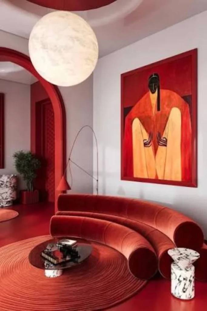
This idea uses a true, saturated pillar box red in a high-gloss finish on an architectural feature, like a fireplace surround or built-in shelving unit.
Why it works
Gloss finishes reflect light, which makes the red feel even more vibrant and turns a plain architectural feature into a genuine design moment.
Best for
Living rooms with a fireplace or built-in shelving that currently feels like dead, boring space.
Styling Tips
Sand and prime properly before painting glossy finishes, since imperfections show up more under sheen. Keep the rest of the room’s palette quiet so this one feature gets full attention.
8. Red, Navy & White Coastal Mix
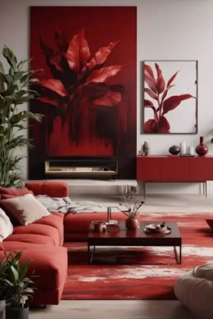
A surprisingly fresh combination where red furniture sits alongside navy blue accents and crisp white walls or trim, creating a nautical, breezy feel.
Why it works
Navy cools red down and gives it a preppy, coastal energy that feels lively rather than heavy, which is unexpected but works beautifully together.
Best for
Beach houses, sunrooms, or any living room that gets lots of natural light.
Styling Tips
Add striped textiles for that classic nautical touch, and keep walls white or off-white so the red and navy can do the heavy lifting.
9. Blush Pink and Red Romantic Pairing
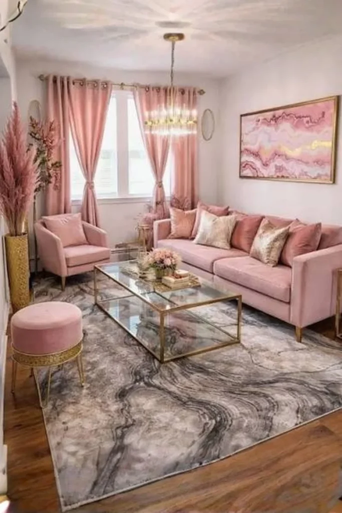
This idea softens red by pairing it with blush pink tones, creating a romantic, slightly vintage feeling living room.
Why it works
Blush takes the edge off red’s intensity, turning a color that can feel aggressive into something warm and almost dreamy.
Best for
Living rooms in homes with a feminine, vintage, or French-country aesthetic.
Styling Tips
Use red as the deeper accent color, like on a single armchair or curtains, while blush dominates the walls or larger upholstery pieces.
10. Red Brick Wall with Industrial Red Accents
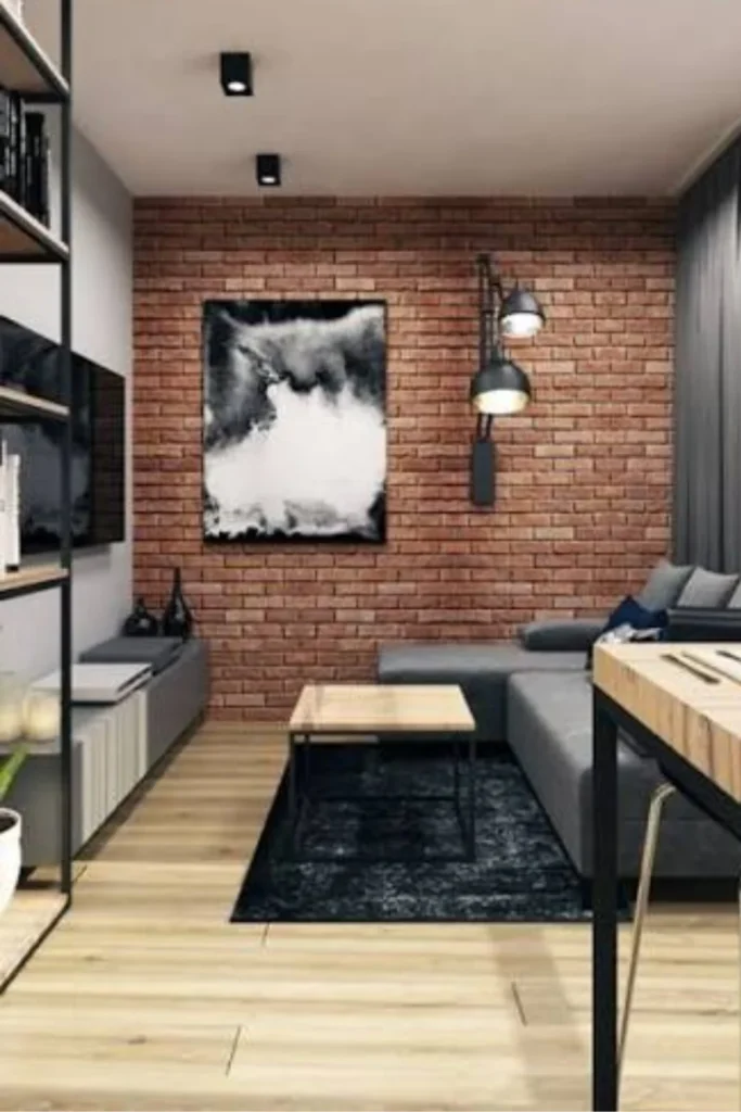
This look pairs an exposed or faux red brick wall with deliberate red decor accents elsewhere in the room, like a red leather chair or red metal shelving.
Why it works
The brick gives you a textured, naturally occurring red tone, so adding more red elsewhere feels cohesive rather than random or forced.
Best for
Loft-style apartments, converted warehouses, or any home with genuine exposed brick.
Styling Tips
Keep other materials raw and industrial, like black metal and reclaimed wood, so the red brick stays the star rather than competing with too many other textures.
11. Rust Red Boho Living Room
A bohemian living room built around rust-toned textiles: kilim rugs, macrame, layered throws, and plenty of plants.
Why it works
Rust has an earthy, well-worn quality that fits naturally into boho layering, where pattern-on-pattern and texture-on-texture is the whole point.
Best for
Eclectic homeowners who love collecting textiles, plants, and global decor pieces.
Styling Tips
Layer at least two patterned textiles in similar rust and red tones, then ground the room with plenty of greenery to balance the warmth.
12. Red Leather Chesterfield Lounge
This idea centers around one iconic piece, a deep red leather Chesterfield sofa, in an otherwise classic, masculine-leaning living room.
Why it works
Leather ages beautifully and the Chesterfield’s tufted shape adds instant character, so the red feels sophisticated rather than loud.
Best for
Studies, libraries, or living rooms with a traditional, gentleman’s-club kind of vibe.
Styling Tips
Pair with dark wood furniture, a few leather-bound books, and brass reading lamps to complete the look.
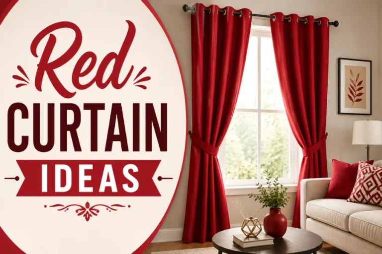
13. Crimson Curtains with Neutral Walls
Here the walls stay completely plain and neutral, while floor-to-ceiling crimson curtains do all the color work.
Why it works
Curtains are a low-commitment, renter-friendly way to bring in bold color, since they can be swapped out anytime without touching the walls.
Best for
Renters or anyone who wants flexibility to change their color scheme down the road.
Styling Tips
Hang curtains as close to the ceiling as possible, even above the actual window frame, to make the room feel taller and more dramatic.
14. Red and Sage Green Balanced Palette
This pairing puts red and sage green side by side, two colors that sit opposite each other on the color wheel and balance one another beautifully.
Why it works
Complementary colors naturally create visual harmony, and the muted, dusty quality of sage keeps red from feeling overly intense.
Best for
Living rooms in homes that want a botanical, slightly vintage farmhouse feel.
Styling Tips
Use sage green for larger surfaces like walls or a sofa, and red as the smaller accent in pillows, art, or a single chair.
15. Tone-on-Tone Red Monochrome Room
This idea uses multiple shades of red together, walls in one tone, sofa in another, accents in a third, all within the same color family.
Why it works
Sticking to one hue family while varying the shade creates depth and sophistication without the visual chaos of mixing in other colors.
Best for
Design-confident homeowners who want a cohesive, gallery-like living room.
Styling Tips
Vary texture as much as shade, mixing velvet, linen, and leather, so the room doesn’t read as flat even though it’s all one color family.
16. Red Floral Wallpaper Cottage Style
A cottage-core take on red, using a small-scale floral wallpaper in red and cream tones paired with vintage furniture finds.
Why it works
Floral pattern softens red’s boldness and gives it a charming, lived-in quality that feels collected over time rather than decorated all at once.
Best for
Cottage-style homes, country houses, or anyone drawn to a grandmother’s-house kind of charm.
Styling Tips
Mix in vintage or antique furniture pieces, and don’t be afraid to add a second smaller floral print on cushions for layered charm.
17. Small Red Reading Nook Corner
Rather than committing the whole room, this idea carves out one small corner, a window seat or armchair nook, dressed entirely in red.
Why it works
It lets you experiment with bold color in a contained area, so even the most red-shy homeowner can enjoy the drama without overwhelming the whole living room.
Best for
Small apartments or anyone who wants a “color moment” without repainting everything.
Styling Tips
Add a red armchair, a small red side table, and a reading lamp, then keep the rest of the living room neutral so the nook reads as a deliberate feature.
18. Open-Concept Red and Charcoal Living Room
A large, open-plan space using deep red furniture against charcoal grey walls and flooring, creating a moody, modern atmosphere.
Why it works
Charcoal is dark enough to hold its own against bold red, so neither color washes the other out, even across a big open floor plan.
Best for
Large modern homes or open-concept living and dining combinations.
Styling Tips
Break up the dark palette with warm wood furniture and plenty of layered lighting, like floor lamps and table lamps, so the room doesn’t feel too dim in the evening.
19. Red Persian Rug Anchored Living Room
This idea starts from the floor up, using a richly patterned red Persian or oriental rug as the foundation, then building a neutral room around it.
Why it works
A patterned rug naturally contains dozens of complementary colors already, so it does the hard work of color-matching for you.
Best for
Living rooms that need warmth and pattern but where the homeowner doesn’t want to commit to red walls or furniture.
Styling Tips
Pull one or two secondary colors from the rug’s pattern and echo them in pillows or artwork to tie the whole room together.
20. Art Deco Red and Black Geometric Living Room
A glamorous, vintage-inspired look using red and black in bold geometric shapes, sunburst mirrors, and lacquered furniture.
Why it works
Art Deco style was practically built for red and black, since the era celebrated drama, symmetry, and high-shine materials.
Best for
Homeowners who love a vintage Hollywood glamour aesthetic.
Styling Tips
Look for furniture with curved or geometric silhouettes, and add a sunburst mirror or lacquered console to nail the deco feel.
21. Red Brick Fireplace Focal Point
This idea keeps the rest of the room neutral and lets a red brick fireplace, whether original or newly built, be the single focal point of the space.
Why it works
A fireplace is already the natural gathering point in most living rooms, so letting its red brick shine makes the whole room feel warm and cohesive.
Best for
Traditional homes with an existing brick fireplace that’s currently being ignored or covered up.
Styling Tips
Avoid painting the brick. Instead, clean it well and let its natural red tone stand out against a soft neutral mantel and wall color.
22. Scandinavian Red Minimalist Living Room
A pared-back Nordic-style living room using just one or two red accents, like a single chair or a piece of art, against an otherwise white and wood palette.
Why it works
Scandinavian design relies on restraint, so a small, carefully chosen red moment stands out far more than it would in a busier room.
Best for
Minimalist homeowners who love clean lines and lots of negative space.
Styling Tips
Choose one single red item and resist the urge to add more. Let white walls, light wood, and simple furniture do the rest of the work.
23. Red Velvet Curtains with Gold Hardware
Similar to the crimson curtain idea but elevated with metallic gold curtain rods, tiebacks, and finials for extra polish.
Why it works
The combination of velvet’s softness and gold’s shine creates a luxe, hotel-suite feeling that instantly elevates a plain window.
Best for
Formal living rooms or anyone wanting a quick glam upgrade without major renovation.
Styling Tips
Choose floor-length curtains and make sure the gold hardware matches other metal finishes in the room, like lamp bases or picture frames.
24. Red and Mustard Yellow Eclectic Living Room
A warm, playful pairing of red and mustard yellow, often layered with vintage furniture and mixed patterns.
Why it works
Both colors sit on the warm side of the color wheel, so they naturally feel related even though the combination feels unexpected and fun.
Best for
Eclectic, maximalist homeowners who enjoy mixing colors and patterns freely.
Styling Tips
Use mustard for larger pieces like a sofa or rug, and red for smaller accents, then add one more neutral, like cream or olive, to keep things from feeling too busy.
25. Dip-Dye Red Curtain Feature Wall
A creative, artistic idea where curtains are dip-dyed from white at the top to deep red at the bottom, paired with a two-tone wall that echoes the same gradient.
Why it works
The ombre effect feels fresh and artistic, giving you the drama of red without a hard, flat block of color across the whole window or wall.
Best for
Creative homeowners or anyone wanting a DIY project that genuinely stands out.
Styling Tips
This is a great weekend DIY using fabric dye on plain cotton curtains. Match the wall’s lower third in a similar red tone for a cohesive gradient look.
26. Red Door Accent in a Neutral Living Room
Rather than touching walls or furniture at all, this idea simply paints an interior door, leading into or out of the living room, a bold red.
Why it works
It’s the lowest-commitment way to bring red into a space, since one door can be repainted in an afternoon, but it still makes a real style statement.
Best for
Anyone wanting to test red before going bigger, or for homes where walls genuinely can’t be painted.
Styling Tips
Use a satin or semi-gloss finish for durability, since doors get touched constantly, and make sure the red tone matches at least one other accent in the room.
27. Maximalist Red Gallery Wall Living Room
A bold, layered living room where a red accent wall serves as the backdrop for an oversized, eclectic gallery wall of mixed frames and artwork.
Why it works
Red is actually one of the best gallery wall backgrounds because it makes black and gold frames pop dramatically while still letting artwork colors shine through.
Best for
Art collectors or anyone with a growing collection of framed prints, photos, and mirrors.
Styling Tips
Mix frame finishes (black, gold, wood) for visual interest, and leave a little breathing room between frames so the wall doesn’t feel cluttered against the bold backdrop.
28. Red Sectional Sofa for Large Family Rooms
A practical idea for big households, this uses a large red sectional as the anchor of a spacious family living room, built for everyday comfortable living.
Why it works
Large sectionals need a strong color to keep them from disappearing into a big room, and red gives a sectional this size real visual weight and warmth.
Best for
Large families, open floor plans, or anyone who needs serious seating capacity.
Styling Tips
Choose a durable, stain-resistant fabric since this will be a high-traffic piece, and balance its size with a large area rug underneath the entire seating arrangement.
29. Compact Red Apartment Living Room
A small apartment living room where red is used thoughtfully through one statement piece, like a slim accent chair or a gallery-style red art print, without overwhelming limited square footage.
Why it works
Small spaces benefit from one bold focal point rather than several competing elements, and red gives an otherwise plain rental apartment real personality.
Best for
Studio or one-bedroom apartments where space and budget are both limited.
Styling Tips
Choose multi-functional furniture in red, like a slim accent chair that doubles as extra seating, and keep walls neutral so the apartment still feels open and bright.
Mistakes to Avoid
The biggest mistake I see homeowners make with red is going all in on day one, painting every wall a bright fire-engine red without testing it first under their room’s actual lighting. Red shifts dramatically between north-facing and south-facing rooms, and what looked perfect on a paint chip can feel completely different once it’s covering four walls. Always sample a swatch and live with it for a few days before committing.
Another common mistake is pairing red with too many other bold colors at once. Red is already a strong personality in the room, so it needs at least one or two quiet, neutral elements to rest against, whether that’s a plain sofa, a simple rug, or unadorned walls. Skipping texture is another issue; flat, matte red paint on every surface can feel one-dimensional, so mixing in velvet, leather, wood, and metal keeps the room feeling layered and intentional.
Lastly, don’t ignore your room’s natural light and size. Dark, saturated reds can make an already small or dim room feel even smaller if used everywhere, so in those cases, it’s smarter to use red as an accent rather than the dominant color. And in large rooms, using too little red can leave the space feeling unfinished, since red needs a bit of scale to truly make its presence felt.
Conclusion
Red is one of those colors that rewards confidence but punishes carelessness. Used thoughtfully, whether that’s a single red door, a velvet sofa, or an entire color-drenched room, it brings warmth, energy, and personality that neutral palettes simply can’t match. The key takeaway from all 29 of these ideas is that there’s no single “right” way to use red. It bends to fit cottage charm, industrial lofts, glam formal rooms, and minimalist Scandinavian spaces alike. Start small if you’re nervous, go bold if you’re ready, and remember that the best red living rooms always balance the color with the right neutrals, textures, and lighting to let it shine without taking over.
FAQs
Does red make a living room feel smaller? It can, especially in bright, saturated shades used on every wall, but darker or earthier reds tend to recede and cocoon a small room rather than shrink it visually. If you’re working with limited square footage, consider using red as an accent rather than covering all four walls.
What colors go best with red in a living room? Gold, black, white, navy, sage green, and warm neutrals like cream and tan all pair beautifully with red. The right choice really depends on the mood you’re after, whether that’s glamorous, coastal, or earthy.
Is red a good color for a living room that doesn’t get much natural light? Yes, surprisingly well. Darker, warmer reds actually work in low-light rooms because they embrace the coziness instead of fighting it, unlike pale neutrals which can look flat and grey without enough sunlight.
How much red is too much in one room? There’s no fixed rule, but a good general guideline is to let red cover no more than about 60 percent of the visible surfaces unless you’re intentionally going for a fully color-drenched look. Balancing it with neutrals keeps the room feeling curated rather than chaotic.
Can red work in a modern or minimalist living room? Absolutely. The Scandinavian minimalist idea on this list proves that even one small red accent, like a single chair or art piece, against a clean white and wood backdrop can make a strong, sophisticated statement.