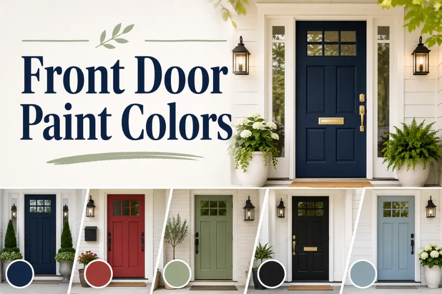
11 Front Door Paint Colors That Will Transform Your Curb Appeal in 2026
Your front door is basically the handshake of your house. It’s the very first thing people notice when they pull into your driveway or walk up your path, and honestly, it says more about your home’s personality than almost anything else on the exterior. A tired, faded, or just plain boring door color can make even a beautifully maintained home look forgettable. On the flip side, the right shade can turn a plain entryway into the kind of thing neighbors slow down to admire.
Here’s the good news: repainting your front door is one of the cheapest, fastest curb appeal upgrades you can do. We’re talking one weekend, one gallon of paint, and a whole new first impression. But with so many colors floating around, picking the “right” one can feel overwhelming. Do you go bold and dramatic? Safe and classic? Something in between?
That’s exactly what this guide is for. I’ve pulled together 11 front door colors that are genuinely trending right now, each with its own personality, undertone, and best-use case. Whether your home is a modern farmhouse, a brick colonial, or a coastal cottage, there’s something here that’ll fit. Let’s get into it.
11 Front Door Paint Colors Worth Considering
Caliente Red
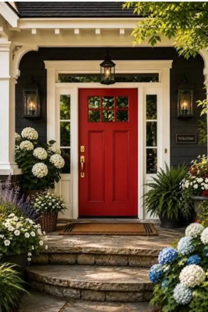
Caliente is that rich, brick-leaning red that feels warm rather than loud. It’s the color equivalent of a good glass of wine — deep, a little dramatic, but never over the top. This shade has been a longtime favorite because it manages to feel both classic and current at the same time, especially compared to flatter, more primary reds.
Why It Works
Caliente sits in that sweet spot between red and brown, so it doesn’t scream for attention the way a fire-engine red door would. It has enough warmth to feel inviting without looking like a stop sign. Because of its slightly muted undertone, it photographs beautifully in both bright sunlight and overcast weather, which is honestly rare for red doors.
Best For
Brick homes, especially red or brown brick, love this color because it either blends in seamlessly or creates gentle contrast depending on the brick tone. It also works great on white or cream-sided colonial and farmhouse style homes where you want a pop of color that still feels traditional.
Styling Tips
Pair it with oil-rubbed bronze or aged brass hardware to keep things warm and cohesive. Avoid cool-toned silver hardware, which can clash with the red’s warmth. Add a natural fiber doormat and a couple of potted boxwoods on either side for that polished-but-not-trying-too-hard look.
Hale Navy
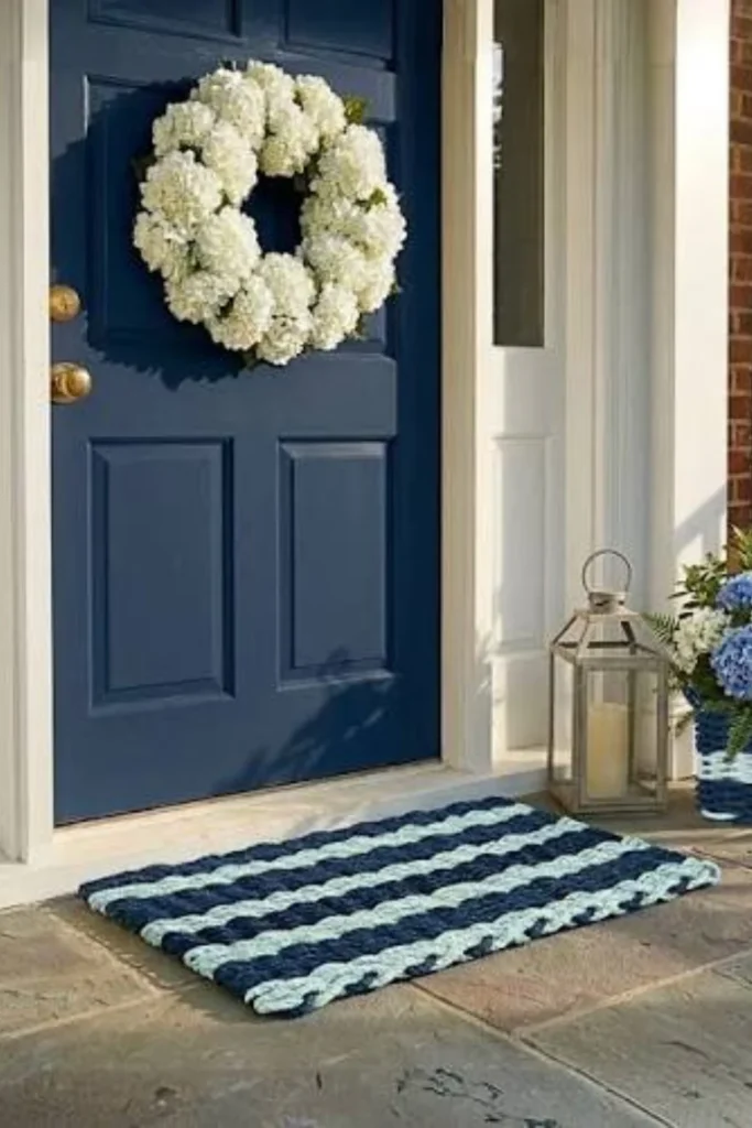
Hale Navy is the front door color that just refuses to go out of style, and there’s a reason for that. It’s a deep, almost-black navy with just enough blue peeking through to keep it from feeling flat or heavy. It’s sophisticated without being fussy.
Why It Works
Navy has this incredible ability to look expensive no matter what house it’s on. It reads as confident and grounded, and because it’s dark, it creates strong contrast against lighter siding, which instantly draws the eye to your entryway. It’s also more forgiving than black when it comes to hiding scuffs and weathering.
Best For
This color is a dream on white, gray, or light blue homes. It’s especially popular on Cape Cod and coastal-style homes, but honestly it works just as well on modern builds and traditional brick homes too. If you want something that feels timeless rather than trendy, this is your color.
Styling Tips
Go with polished nickel or brushed brass hardware — both work beautifully against navy. A pop of greenery, like ferns or a wreath with eucalyptus, adds softness against the deep tone. Keep your porch lighting warm-toned (not cool white) so the navy doesn’t look overly cold at night.
Wrought Iron Black
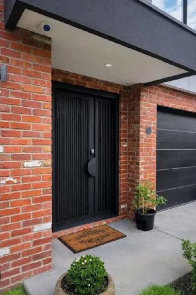
Wrought Iron isn’t your average flat black. It has a soft charcoal undertone that keeps it from feeling harsh, giving it a slightly softened, almost graphite-like quality. It’s moody, modern, and undeniably chic.
Why It Works
Black doors have that instant “custom home” look because the color absorbs light and creates crisp, clean contrast against almost any siding color. This particular shade avoids looking too stark or industrial thanks to its gentle undertone, so it feels sophisticated rather than cold.
Best For
This is the color for you if your home has a modern, farmhouse, or transitional style. It’s especially striking on white or light gray exteriors, and it pairs beautifully with black window frames or black porch railings if you’ve already got those elements going.
Styling Tips
Matte black or aged brass hardware both look incredible here, so pick based on whether you want moody-modern (matte black) or warm-contrast (brass). Because black shows dust and pollen more than other colors, plan on wiping it down every few weeks to keep that crisp look.
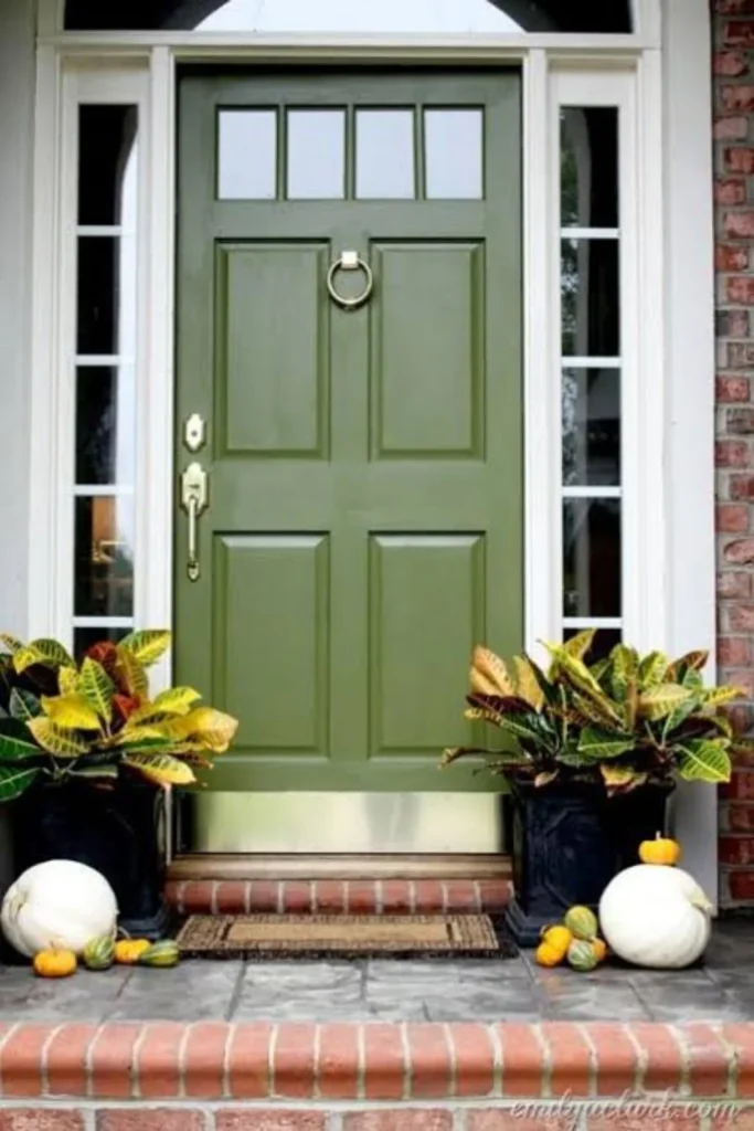
Olive Grove Green
Olive Grove is a deep, muted green that leans earthy rather than bright or minty. Think the color of olive leaves in low light — grounded, natural, and quietly elegant. This is one of the biggest movers in exterior color trends right now.
Why It Works
Green has this natural, calming quality that makes a home feel connected to its landscaping instead of separate from it. Olive Grove specifically avoids feeling too bold or costume-y because of its muted, brownish undertone, which makes it far easier to live with long-term than a brighter green.
Best For
This shade genuinely works on almost every exterior color, which is part of why it’s so popular right now. It’s especially beautiful against white, cream, tan, or natural wood siding, and it plays incredibly well with stone accents and lush landscaping.
Styling Tips
Lean into the natural theme with warm wood elements, like a wood bench or wood-look house numbers. Brass or aged bronze hardware complements the earthy tone nicely. Skip anything too shiny or cool-toned, since it can fight with the grounded, organic feel of the color.
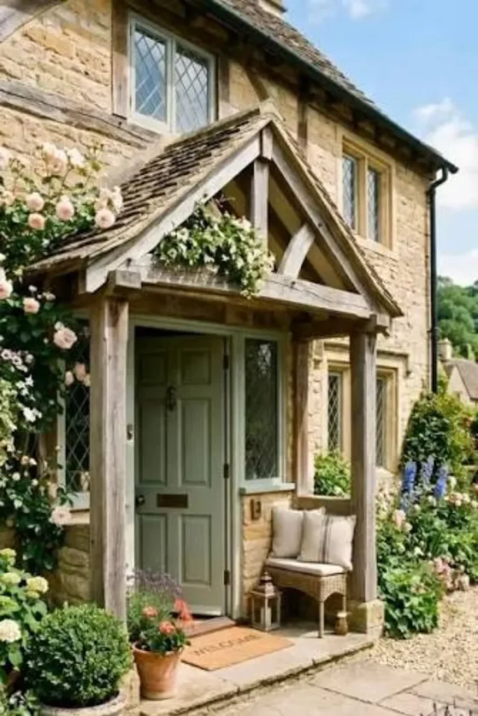
Saybrook Sage
Saybrook Sage is a soft, grayed-out green that reads more neutral than colorful. It’s the kind of shade that people often can’t quite name when they see it — is it green, is it gray, is it both? That subtlety is exactly its charm.
Why It Works
This color gives you the calming effect of green without the commitment of a true, saturated shade. Because it leans so neutral, it’s incredibly easy to coordinate with existing exterior colors, and it tends to be one of the more HOA-friendly options if your neighborhood has color restrictions.
Best For
Saybrook Sage is perfect for homeowners who want something a little different from basic white or black but aren’t ready to go full color. It looks gorgeous on farmhouse-style homes, especially those with white board-and-batten siding or natural stone details.
Styling Tips
Pair with black or oil-rubbed bronze hardware for definition, since the soft color needs a little contrast to avoid looking washed out. A dark-colored doormat and simple, uncluttered planters keep the overall look clean and intentional rather than busy.
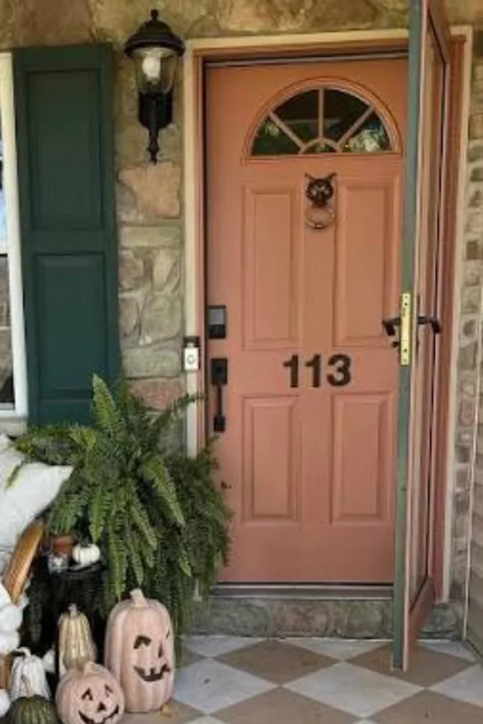
Heritage Terracotta
Heritage Terracotta is a warm, clay-inspired orange-red that feels earthy and sun-baked rather than bright or citrusy. It’s a more grown-up, design-forward alternative to a traditional bold orange door, and it’s having a real moment right now.
Why It Works
This color taps into the whole “warm, grounded, nature-inspired” trend that’s taking over exterior design. Unlike a true orange, which can feel like a costume choice, terracotta reads as intentional and stylish because of its earthy, muted base. It also pairs beautifully with the blue-gray and warm neutral tones that are popular right now.
Best For
Terracotta shines on Spanish-style, adobe, and Mediterranean homes where it feels completely at home, but it’s also a fantastic surprise pick for more modern homes with stucco or warm-toned siding looking for something unexpected.
Styling Tips
Pair it with soft blue-gray accents somewhere on your porch, like planters or seat cushions, for that warm-cool contrast designers love right now. Aged brass or matte black hardware both work here depending on whether you want warm or moody contrast.
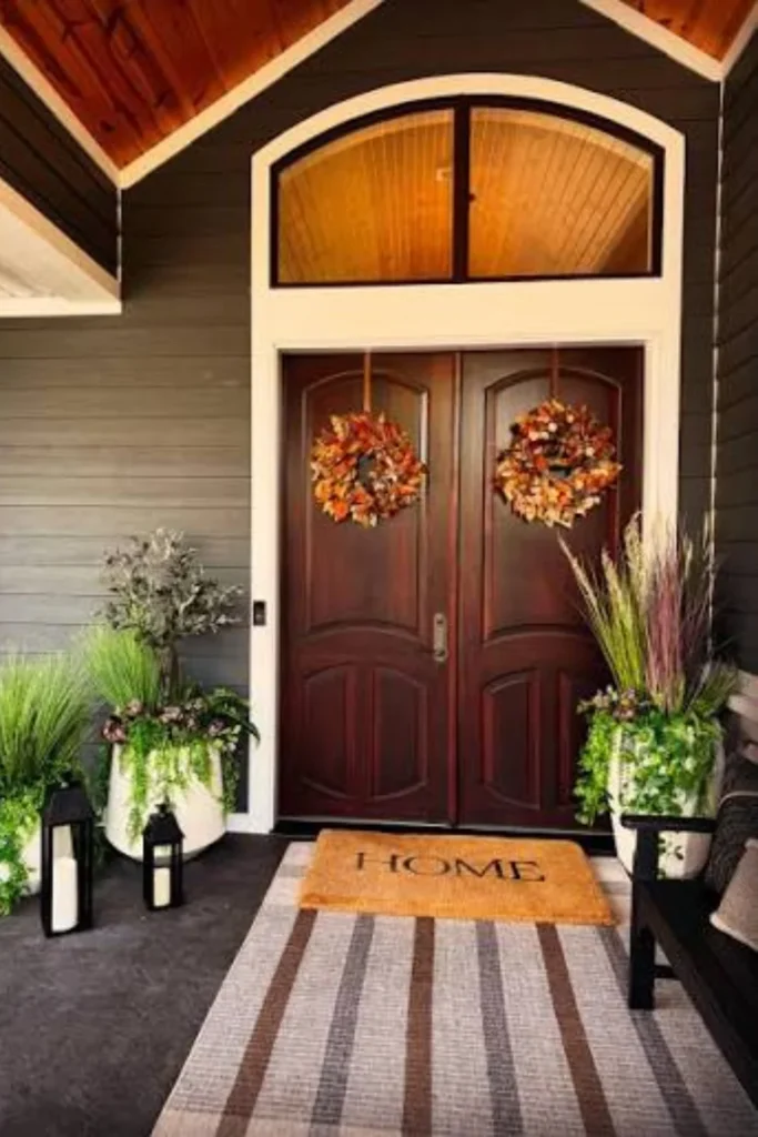
Bracken Brown
Bracken Brown is a deep, tailored brown that leans almost charcoal in certain lighting. It gives you all the richness and warmth of a stained wood door without any of the maintenance that comes with real wood staining.
Why It Works
Brown has quietly become one of the most requested “quiet luxury” exterior colors because it feels expensive and understated at the same time. It doesn’t shout for attention like red or navy might, but it still adds noticeable depth and sophistication compared to a plain white or beige door.
Best For
This color is an especially great match for homes with warm-toned brick, stone, or wood accents already in place, since it ties everything together seamlessly. It’s a favorite for craftsman-style homes and anything with a more traditional, established look.
Styling Tips
Keep hardware in warm metals like brass, bronze, or copper to play up the richness of the brown. A woven doormat and simple greenery finish the look without competing with the door’s depth. Avoid stark white trim right next to it if you want a softer, more blended look.
Split Pea Green
Split Pea is a bright, slightly yellow-leaning green that’s far more playful and lively than deep greens like olive or sage. It brings genuine personality and cheer to an entryway without tipping into “too much.”
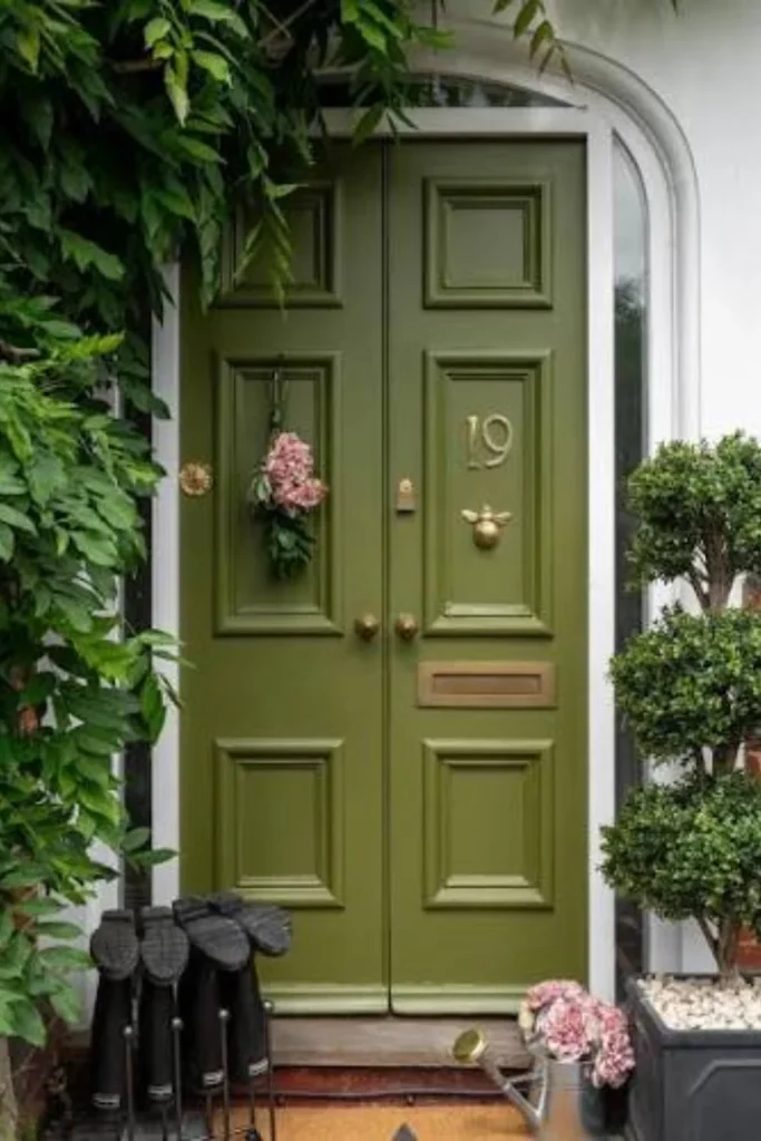
Why It Works
This shade gives homeowners a colorful alternative to the endless sea of gray and beige doors, and it does it in a way that still feels grounded and natural rather than neon or costume-like. It’s proof that a colorful front door doesn’t have to mean sacrificing good taste.
Best For
Split Pea is ideal for homes that already lean a little more playful or eclectic — think cottage-style homes, bungalows, or anywhere with a garden-forward front yard. It also looks fantastic against white, gray, or navy siding for real contrast.
Styling Tips
Let the door be the star and keep everything else simple: neutral hardware, a plain doormat, and understated planters. Too many additional colors nearby can compete with this already-vibrant shade, so resist the urge to over-accessorize.
Eggplant Mudroom Purple
This deep, moody purple leans more toward aubergine than lavender, giving it a rich, almost jewel-toned quality. It’s unexpected, a little daring, and exactly the kind of color choice that gets your house noticed for all the right reasons.
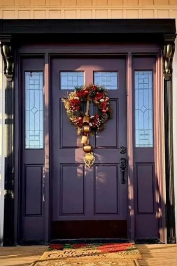
Why It Works
Purple doors are rare, which instantly makes your entryway feel more custom and personal. This particular shade works because it’s dark and grounded rather than bright or pastel, so it reads as sophisticated rather than novelty. Designers have been extending this color from interior mudrooms out to front doors for exactly this reason.
Best For
This is a great option for homeowners who want to stand out on their block without going full color-block crazy. It looks beautiful on white, gray, or even soft pink exteriors, and it’s especially striking on homes with a more eclectic, design-forward personality.
Styling Tips
Pair with warm brass or gold hardware to keep things feeling rich rather than gothic. Adding pink or blush-toned flowers nearby can echo the purple’s undertone beautifully. Keep the rest of your porch palette simple so the door remains the focal point.
Cloud White
Cloud White is a soft, warm-leaning white that’s calmer and gentler than a stark, clinical white. It has just enough warmth in its undertone to feel cozy rather than sterile, which makes it endlessly versatile.
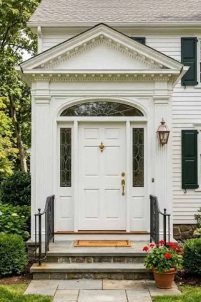
Why It Works
White doors have that timeless, crisp, “well cared for” look that never really goes out of style. Unlike bright whites that can feel a little cold or hospital-like, Cloud White’s soft undertone keeps things feeling warm and welcoming, especially in natural daylight.
Best For
This shade works on literally any home style or siding color, which is exactly why it’s such a popular safe choice. It’s especially lovely on colorful homes where you want the door to feel calm and cohesive rather than competing with an already busy exterior.
Styling Tips
Because white shows dirt more easily, plan on a gentle wipe-down every couple of weeks, especially near the bottom of the door. Black or brass hardware both look sharp against this shade. A colorful wreath or bright doormat can add personality without overwhelming the softness of the white.
Newburyport Blue-Gray
This shade sits right at the intersection of blue and gray, giving you a color that shifts subtly depending on the light. It’s soft, coastal, and endlessly easy to live with, without feeling boring the way a flat gray sometimes can.
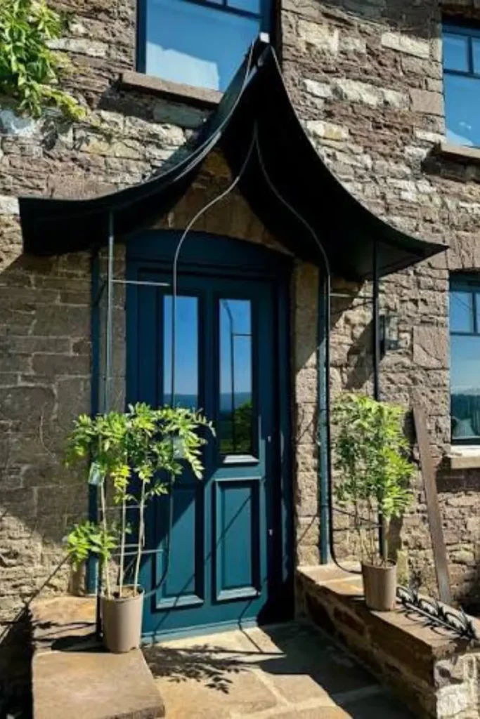
Why It Works
Blue-gray tones have overtaken flat, mid-tone grays in popularity because they bring in a little more warmth and personality while still reading as neutral. This color gives you that “put together” neutral look without falling into the drab, dated gray trend that a lot of designers are moving away from.
Best For
This is a fantastic pick for coastal homes, cottages, and anywhere with a relaxed, breezy vibe, but it also works surprisingly well on more traditional homes looking for a subtle upgrade from basic gray or beige.
Styling Tips
Pair with polished nickel or chrome hardware to lean into the cool, coastal feel, or warm it up with brass if you want a softer contrast. Natural textures like rope doormats, woven baskets, or driftwood accents complement this color beautifully.
Mistakes to Avoid When Choosing a Front Door Color
Skipping the sample test. Paint always looks different on your actual door than it does on a swatch or a screen. Always buy a small sample and test it directly on your door in both morning and evening light before committing to a full gallon.
Ignoring your home’s undertones. Every siding, brick, and stone color has warm or cool undertones, even if they’re subtle. Picking a door color with clashing undertones is one of the most common reasons a paint job ends up looking “off” even though the color seemed great in the store.
Forgetting about the finish. The sheen matters just as much as the color itself. A finish that’s too flat can look chalky and cheap, while one that’s too glossy can highlight every imperfection on an older door. Satin or semi-gloss tends to be the sweet spot for most front doors.
Not checking HOA rules first. Bold, saturated colors are gorgeous, but plenty of neighborhoods have restrictions on exterior colors. Always check your HOA guidelines before buying paint, especially if you’re leaning toward something dramatic like black, red, or navy.
Choosing a color that clashes with your roof or landscaping. Your door doesn’t exist in isolation. Take a step back and consider your roof color, your landscaping, and your overall exterior palette before locking in a final choice.
Using interior paint outdoors. This one seems obvious, but it happens more than you’d think. Always use paint specifically formulated for exterior use, since it’s built to withstand sun exposure, temperature swings, and moisture in a way interior paint simply isn’t.
Conclusion
At the end of the day, your front door color is one of the easiest, most impactful ways to give your home a fresh new look without a full renovation budget. Whether you’re drawn to the timeless confidence of Hale Navy, the earthy warmth of Olive Grove, or the unexpected charm of Eggplant Mudroom Purple, the best choice is ultimately the one that feels true to your home’s personality and your own taste.
Take your time, test a sample or two, and don’t be afraid to go a little bolder than you normally would. A front door is a small enough surface that even a daring color choice is low-risk, but the payoff in curb appeal and personality can be huge. Happy painting.
FAQs
How much paint do I need for a front door? Most standard front doors only need one quart to one gallon of exterior paint, depending on the number of coats. It’s always smart to buy a little extra in case you need touch-ups down the line.
What finish is best for a front door? Satin or semi-gloss finishes are generally the best choice because they offer a nice balance of durability and shine without being overly glossy or too flat.
Do I need to prime my front door before painting? Yes, especially if you’re changing colors dramatically or painting over an unfinished or previously stained door. Primer helps the new color go on evenly and last much longer.
How often should a front door be repainted? On average, a front door should be repainted every five to seven years, though darker colors in high-sun areas may need refreshing a bit sooner due to fading.
Can I paint over a stained wood door? Yes, as long as you properly sand and prime the surface first. Skipping this step is one of the most common reasons paint fails to adhere properly on wood doors.
Does the front door color really affect home value? Yes, studies and real estate data consistently show that a well-chosen front door color can positively influence buyer perception and curb appeal, especially deeper, more refined tones over harsh or overly personalized colors.