
27 Dream House Interior Ideas That Actually Work in Real Homes
Every dream home board on Pinterest looks the same after a while, doesn’t it? Marble islands, white walls, a velvet sofa, repeat. The truth is, a house that actually feels like “yours” comes from picking ideas that fit your actual square footage, your actual budget, and your actual life, not just what’s trending this month.
I’ve spent years pulling apart rooms, repainting them, moving furniture around at midnight because something just wasn’t sitting right, and helping friends turn awkward corners into their favorite spot in the house. What I’ve learned is that the best interiors mix scale on purpose. A home needs a few quiet, small moments (a window seat, a reading nook) next to a few bold, large statements (a sunken living room, a sculptural island) so the whole place breathes instead of feeling like one long Instagram scroll.
That’s exactly what this list is built around. Below are 27 dream house interior ideas, ranging from tiny corners you can finish in a weekend to big-ticket rooms worth planning a renovation around. Every single one is realistic, meaning you could genuinely build it, not just admire it from a screen. Grab a coffee, scroll through, and start a mental list of which ones belong in your home.
27 Dream House Interior Ideas You’ll Actually Want to Copy
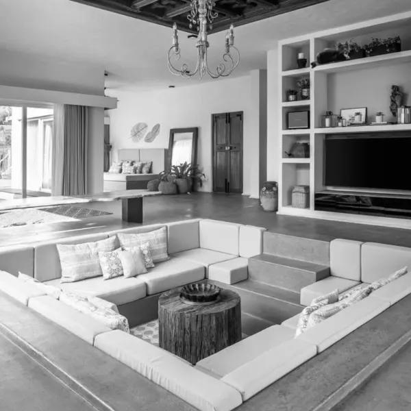
1. Sunken Conversation Pit Living Room
A sunken seating area drops your living room floor down a step or two, wrapping a built-in sofa around a fireplace or coffee table. It instantly feels like a retro-cool hangout spot rather than a regular living room, and it naturally pulls people together for conversation instead of staring at a TV across the room.
Why it works
Lowering the floor creates a visual boundary without adding a single wall, so the space feels separated and cozy while staying totally open to the rest of the home. It also lowers your eye line, which makes tall ceilings feel even more dramatic above you.
Best for
Larger open-concept homes with at least 9-foot ceilings, since you’re sacrificing a bit of height for the sunken section. It’s a fantastic match for ranch homes, mid-century builds, or anyone doing a full living room renovation from scratch.
Styling Tips
Keep the steps down shallow and well lit with hidden LED strips so nobody trips at night. Stick to one continuous flooring material between the upper and lower levels so the transition reads as intentional, and pile on floor cushions instead of extra furniture to keep the pit feeling lounge-y, not cluttered.
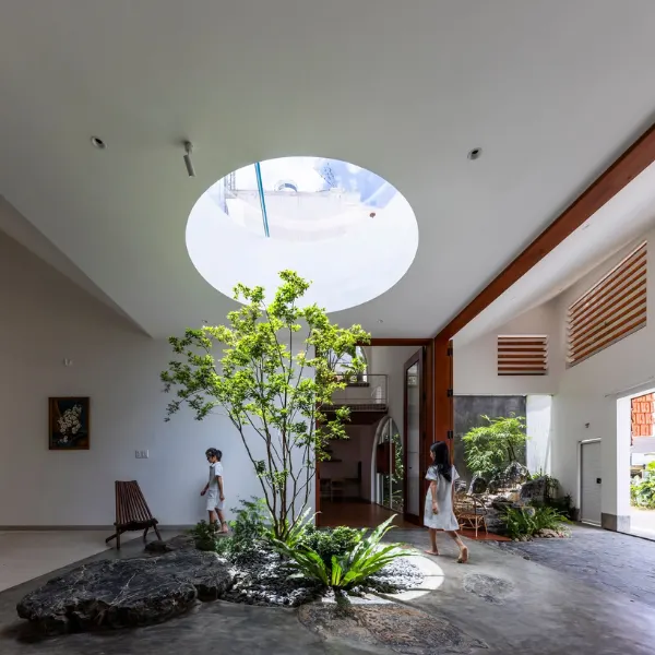
2. Indoor Courtyard with a Skylight
This is a small open-air or skylight-covered pocket built into the middle of your home’s footprint, usually filled with plants, a bit of stone flooring, and maybe a single bench. Think of it as bringing a slice of garden indoors, right where you’d normally have a dead hallway or unused corner.
Why it works
A courtyard pulls daylight into the center of the house, which is usually the darkest part of any floor plan. It also breaks up long hallways and gives every room around it a view of something green instead of another wall.
Best for
Homes with a center hallway, an L-shaped or U-shaped floor plan, or anyone doing new construction who can plan the layout around it from day one. It works beautifully in warmer climates where you can leave it partially open to the sky.
Styling Tips
Choose plants that tolerate the specific light your courtyard gets, ferns and pothos for shadier spots, succulents or olive trees for sun-drenched ones. Add a simple drainage system in the flooring so watering doesn’t become a headache, and keep furniture minimal: one bench or a pair of chairs is plenty.
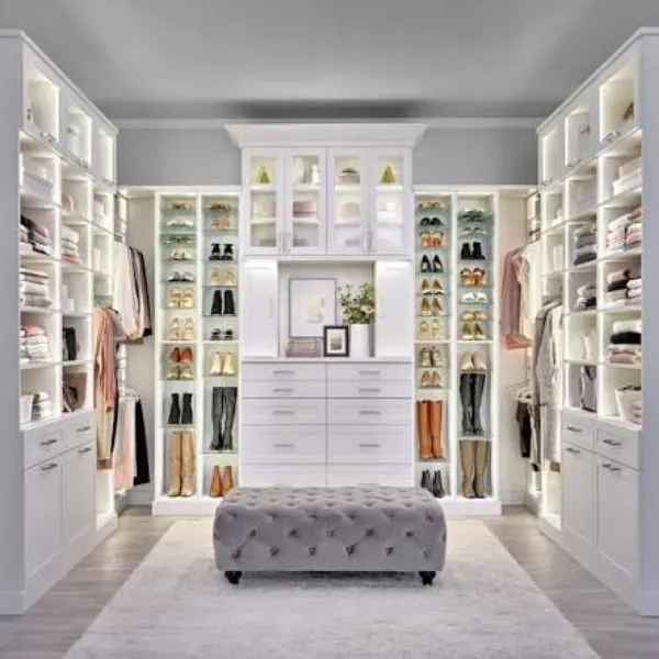
3. Walk-In Closet with a Center Island
Instead of a wall of hanging rods and a dresser, this closet gets a freestanding island in the middle, similar to a kitchen island, with drawers for jewelry, a flat surface for laying out outfits, and sometimes a marble or quartz top for a boutique feel.
Why it works
The island adds storage without eating into your wall space, and it gives you somewhere to actually fold and organize clothes instead of dumping them on the bed. It also turns a purely functional room into one that feels like a personal little shop.
Best for
Primary bedrooms with at least 80 to 100 square feet of closet space. If your closet is on the smaller side, a single-sided island with drawers on just one face still works without crowding the walkway.
Styling Tips
Leave at least 36 inches of clearance on every side of the island so you can comfortably move around it. Top it with a material that matches your cabinetry, and add a small pendant or chandelier above it so the closet feels like a finished room rather than leftover storage.
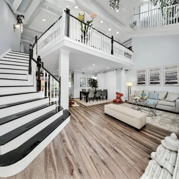
4. Dual Primary Suites for Multigenerational Living
This setup gives a home two full primary-style bedrooms, each with its own attached bathroom and closet, placed on opposite ends of the house or floor. It’s designed for grown kids moving back home, aging parents, or even two adult couples sharing a property comfortably.
Why it works
Privacy is the whole point. Everyone gets a real retreat instead of squeezing into a guest room and sharing one bathroom, which cuts down on the daily friction that comes from multiple adults living under one roof.
Best for
Larger single-story homes or homes being built or majorly renovated, since adding a second full bathroom usually means moving plumbing lines. It’s especially popular with families planning for aging parents or adult children staying long term.
Styling Tips
Give each suite its own distinct color palette and finishes so both feel personal rather than like matching hotel rooms. Soundproofing the shared wall between them with extra insulation or a sound-dampening drywall layer makes a noticeable difference in everyday comfort.
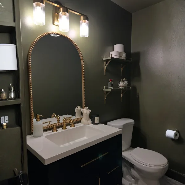
5. Color-Drenched Powder Room
Color drenching means painting the walls, trim, ceiling, and sometimes even the door of a single small room in one saturated color, top to bottom. In a tiny powder room, this creates a jewel-box effect that feels far more glamorous than a small bathroom usually gets credit for.
Why it works
In a small room, having different colors on the walls versus the trim actually chops up the space visually and makes it feel choppier and smaller. One continuous color removes those visual stop points, so your eye reads the whole room as one bigger, richer shape.
Best for
Powder rooms, small laundry rooms, or any windowless nook under 50 square feet where you want to make a bold style statement without committing an entire main living space to it.
Styling Tips
Go with a paint finish that has at least a satin sheen so it can handle moisture and bounce a little extra light around. Deep jewel tones like emerald, ink blue, or burgundy photograph beautifully and pair well with brass or matte black fixtures.
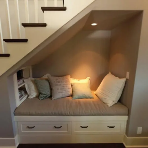
6. Under-the-Stairs Reading Nook
That awkward triangular space underneath a staircase, the one most homes just leave as dead storage, gets turned into a built-in seat with cushions, a small bookshelf, and a reading light tucked into the slanted ceiling above.
Why it works
You’re reclaiming square footage that was already going to waste, and the sloped ceiling actually gives the nook a cozy, cocoon-like feeling instead of being a design problem. It’s one of the few spots in a house that feels secret and grown-up at the same time.
Best for
Any home with a staircase that has open or boxed-in space underneath, particularly in homes where every square foot matters, like townhouses, narrow city lots, or smaller family homes.
Styling Tips
Build the bench seat with storage underneath using a lift-up lid or pull-out drawers, since you’re already custom-building the space anyway. Add a reading lamp on a dimmer switch and keep the cushion fabric durable, since this spot tends to get used daily once it exists.
7. Built-In Banquette Breakfast Nook
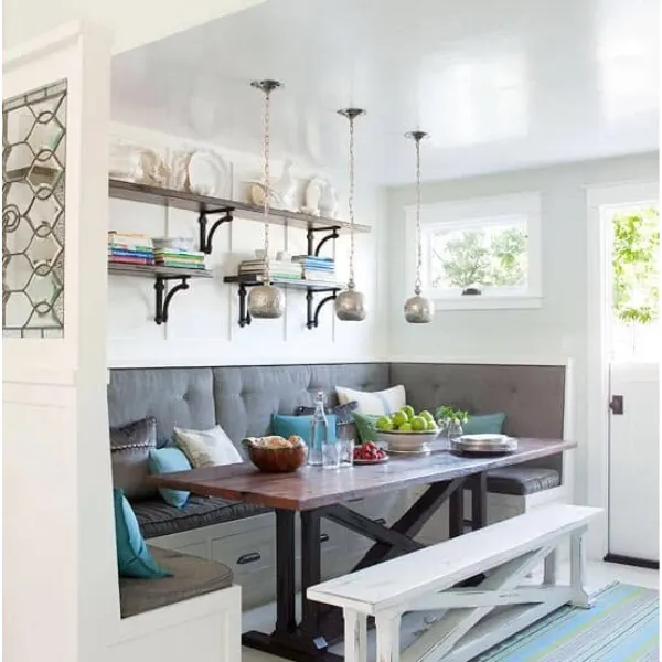
A banquette is an upholstered bench seat built directly into a wall corner, usually paired with a small table and a couple of chairs on the open side. It turns an awkward kitchen corner into the most requested seat in the house.
Why it works
Banquettes seat more people per square foot than a regular table and chairs setup because the bench tucks tightly against the wall. The built-in nature also gives the kitchen a custom, designed feel rather than a thrown-together breakfast table situation.
Best for
Kitchen corners, especially in galley kitchens or smaller dining areas where a full dining set wouldn’t fit comfortably. It also works beautifully bridging a kitchen and living room in open-concept layouts.
Styling Tips
Build in storage under the bench seat for pots, pans, or linens you don’t use daily. Choose a performance fabric like a treated linen blend so spills wipe up easily, and add a round table if you can, since rounded edges feel friendlier in a tight corner.
8. Attic Loft Bedroom with a Skylight
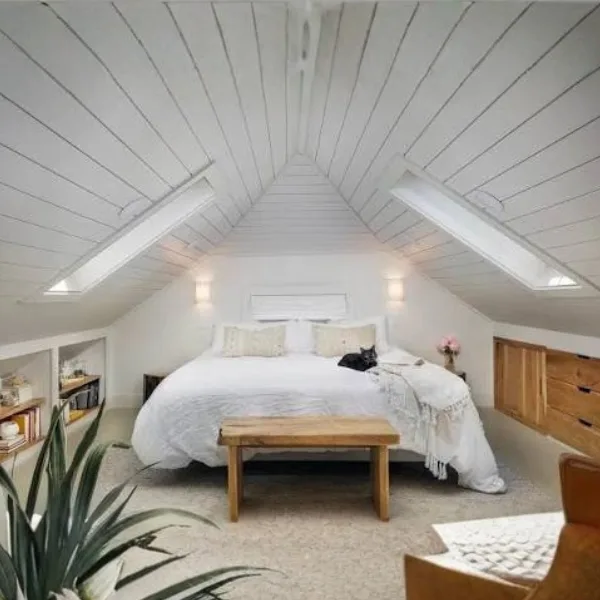
This takes an unfinished or underused attic and turns it into a snug bedroom, using the sloped ceiling lines as part of the charm instead of fighting against them, with one or two skylights cut into the roof for natural light and stargazing.
Why it works
Attics already have personality built in, the angles, the exposed beams, the quiet distance from the rest of the house. A skylight solves the lighting problem attics usually struggle with and adds a genuinely magical detail that flat-ceiling bedrooms can’t compete with.
Best for
Homes with steep roof pitches and at least 7 feet of headroom at the tallest point. It’s a great solution for growing families needing an extra bedroom without adding square footage to the home’s footprint.
Styling Tips
Place the bed under the lowest part of the slope, since you need less headroom there anyway, and reserve the taller center of the room for walking around and dressing. Insulate well, since attics run hotter in summer and colder in winter, and pick blackout-capable skylight shades for actual sleep.
9. Tech-Free Analog Library Den
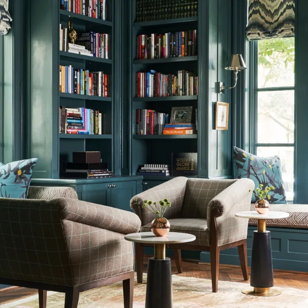
A small den or study dedicated entirely to books, board games, and conversation, with no TV, no visible charging station, and no screens in sight. It’s a deliberate step back from the glowing-screen default that most living rooms have become.
Why it works
Having one room in the house with an unwritten “no screens” rule gives everyone, kids included, an actual reason to put devices down. The lack of a TV also means the furniture can finally face each other instead of all pointing at a wall.
Best for
Homes with a spare room, formal dining room nobody uses, or even a generous closet that can be converted. It works in both small apartments and large houses, since the concept scales with whatever floor space you give it.
Styling Tips
Build floor-to-ceiling shelving on at least one wall and fill it with actual books, not just decor objects, since this room is meant to be used. Add a record player or a deck of cards on a side table as a quiet invitation, and use warm, dimmable lighting instead of bright overheads.
10. Floating Vanity Spa-Style Bathroom
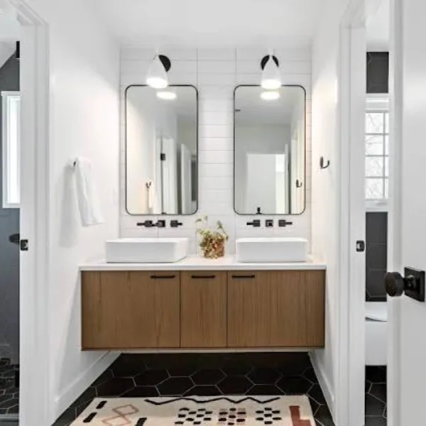
Swapping a boxy vanity cabinet for a floating one mounted on the wall, with open space underneath, instantly changes how a bathroom feels. Pair it with a freestanding tub or a rainfall shower head and the whole room starts to feel like a small home spa.
Why it works
That open gap under the vanity tricks the eye into seeing more floor, which makes even a genuinely small bathroom feel airier. It also makes cleaning the floor ten times easier since there’s nothing blocking the mop.
Best for
Small to medium bathrooms, especially primary bathrooms under 80 square feet where every visual inch matters. It’s also a smart pick for half-baths that get a lot of guest traffic.
Styling Tips
Choose a vanity in a light wood tone or a soft matte color rather than a busy pattern, since the goal is calm, not bold. Add a backlit mirror and a couple of olive or eucalyptus stems in a vase, two cheap details that punch way above their price tag.
11. Gallery Wall That Climbs to the Ceiling
Instead of stopping your framed art and photos at standard eye level, this idea takes the gallery wall all the way up to the ceiling, using the full height of the wall as your canvas.
Why it works
Pulling the eye upward makes a room feel taller than it actually is, which is a free trick for anyone dealing with standard 8-foot ceilings. It also turns a hallway or staircase wall, two spots most people ignore, into the most personal part of the house.
Best for
Narrow hallways, stairwells, or any room with low or average ceiling height where you want a sense of drama without any actual construction.
Styling Tips
Lay your frames out on the floor first to plan the arrangement before a single nail goes in the wall. Mix frame sizes and a couple of black-and-white photos in with color ones to keep the wall from feeling too busy, and use picture-hanging strips for the lighter pieces near the top so you’re not drilling at an awkward height.
12. Mixed-Metal Kitchen Hardware Story
Rather than matching every faucet, cabinet pull, and light fixture in the kitchen, this idea intentionally mixes two metal finishes, like matte black hardware with warm brushed brass fixtures, to add depth without looking mismatched.
Why it works
A kitchen with only one metal finish everywhere can start to feel flat and showroom-like. Mixing two tones, when done with a plan, reads as collected and intentional rather than accidental, the same way a great outfit mixes textures instead of matching head to toe.
Best for
Any kitchen renovation or hardware refresh, regardless of size, since this is purely a finish decision and doesn’t require more square footage or layout changes.
Styling Tips
Pick one metal to be the “main” finish, used on roughly 70 percent of your hardware, and a second metal for accents like pendant lights or a faucet. Keep warm and cool tones balanced, brass with matte black, or brushed nickel with warm bronze, rather than mixing two cool or two warm metals that fight each other.
13. Statement Sculptural Kitchen Island
This island skips the standard rectangle and goes for a curved, organic shape, often paired with a waterfall edge where the countertop material wraps down the sides like a tablecloth. It becomes the visual centerpiece of the entire kitchen instead of just a workspace.
Why it works
Curves break up the boxy, hard-edged feeling that most kitchens default to, and a waterfall edge shows off your countertop material as a feature rather than just a surface. It’s the kind of detail people notice the second they walk in.
Best for
Larger kitchens with open floor plans, ideally with at least 42 inches of clearance on every side of the island so the curved shape doesn’t crowd the walking path.
Styling Tips
Stick to one statement material, like a veined marble or quartzite, and keep everything else around it simple so the island actually gets to be the star. Pair it with a few tall stools in a contrasting material, leather or wood, to soften the stone’s coolness.
14. Living Wall Plant Accent
A living wall is a vertical garden built directly into an interior wall, using a mounted planter system to hold rows of small plants like pothos, ferns, or moss in a tight grid pattern.
Why it works
It brings a genuinely jaw-dropping amount of greenery into a home without taking up any floor space, which matters a lot in smaller homes. It also improves the air quality in the room and gives you a living, changing piece of “art” that no poster could match.
Best for
Entryways, behind a sofa, or as a backdrop in a home office, ideally near a window or under a grow light since most leafy plants need decent light to survive long term.
Styling Tips
Start smaller than you think you want, a 3-by-3-foot section is plenty for a first attempt, and choose plants known for being low-maintenance and forgiving, like pothos or ferns, rather than fussy tropicals. Set a watering reminder on your phone, since living walls dry out faster than potted plants.
15. Moody Color-Drenched Home Office
This takes the same color-drenching idea from the powder room and applies it to a home office, using a deep, saturated tone like forest green, navy, or burnt clay on the walls, trim, and ceiling.
Why it works
A darker, richer color in a workspace actually helps with focus, since it removes the visual distraction of bright white walls and gives the room a cocoon-like, “library” feeling that makes long work sessions feel more intentional.
Best for
Small to medium home offices, spare bedrooms converted into work spaces, or any room with good task lighting since darker walls need brighter, well-placed lamps to balance them out.
Styling Tips
Pair the dark walls with a light-colored desk and warm brass or wood accents so the room doesn’t feel like a cave. Add a statement rug in a lighter tone to ground the floor and bounce a bit of light back up into the space.
16. Layered-Texture Living Room
Instead of relying on color or pattern to make a living room interesting, this idea leans entirely on texture, mixing a velvet sofa, a boucle accent chair, linen curtains, and a raw stone or wood coffee table in the same neutral-ish color family.
Why it works
When everything is roughly the same tone, your eye starts noticing texture instead, the softness of velvet against the roughness of stone creates richness without needing bold colors or busy patterns. It’s a sophisticated way to add depth to a calm, neutral room.
Best for
Living rooms in any size home where the homeowner prefers a quieter color palette but still wants the room to feel layered and high-end rather than flat.
Styling Tips
Pick at least three different textures and place them next to each other rather than scattered across the room, velvet next to wood, boucle next to linen. Stick to a tight color palette, two or three shades max, so texture stays the main event.
17. Zoned Open-Concept Great Room
This is an open floor plan with a twist: instead of one giant undivided space, the living, dining, and kitchen areas flow together but get subtly separated using a change in flooring, a half wall, a ceiling beam, or a furniture arrangement, creating “zones” within the openness.
Why it works
Fully open floor plans can feel a little directionless, like nobody knows where one room stops and another starts. Zoning solves that without sacrificing the airy, connected feeling that makes open concept popular in the first place.
Best for
Larger new builds or major renovations where the floor plan is being decided from scratch, since this works best when planned early rather than retrofitted.
Styling Tips
Use a rug to define the living room zone and a different flooring material or level change for the dining area. A single statement beam on the ceiling running between zones, even just decoratively, helps the eye understand where one space ends and the next begins.
18. Wet-Room Style Bathroom
A wet room combines the shower and the rest of the bathroom into one continuous waterproofed space, with no shower door or curtain separating them, just a slight slope in the floor directing water toward a drain.
Why it works
Removing the shower enclosure makes a small bathroom feel significantly larger because there’s no glass wall chopping up your sightline. It’s also easier to clean since there’s no door track or curtain collecting grime.
Best for
Small bathrooms, tiny homes, or anyone designing a primary bathroom from scratch, since proper waterproofing and floor sloping really needs to be planned during construction or a full renovation.
Styling Tips
Use large-format tile to minimize grout lines, which helps the whole floor read as one continuous surface. Add a sliding or pivoting half-glass panel near the shower zone if you want a little splash protection without losing the open, spacious feeling.
19. Built-In Window Seat Reading Alcove
A window seat is a cushioned bench built directly into a window nook, often with storage underneath and a couple of throw pillows, turning a previously wasted window ledge into the coziest seat in the house.
Why it works
Most homes have at least one window deep enough to support a bench, and that spot already comes with great natural light built in. It’s a small footprint upgrade that adds a huge amount of charm and function.
Best for
Bedrooms, living rooms, or even a stair landing, anywhere there’s a window with at least 18 inches of depth on the sill or surrounding wall space.
Styling Tips
Build in a hinged lid over the storage area so it doubles as a blanket or toy chest. Layer the cushion with a mix of pillow sizes, and hang curtains slightly above and wider than the window frame so the whole alcove feels a little grander.
20. Hand-Painted Freehand Accent Wall
This wall skips wallpaper and stencils entirely in favor of loose, hand-painted brushstrokes, think big sweeping arcs, organic blob shapes, or abstract line work, applied directly with a paintbrush for a one-of-a-kind, artistic finish.
Why it works
No two hand-painted walls ever look exactly the same, which gives the room a genuinely custom feel that no printed wallpaper can replicate. The slightly imperfect brush marks also add warmth and personality compared to a perfectly flat painted wall.
Best for
A single accent wall in a bedroom, dining room, or entryway, rather than an entire room, since this look is meant to be a focal point, not an overwhelming backdrop.
Styling Tips
Practice your brush strokes on a scrap piece of cardboard before committing to the wall, and use a slightly thinned-down paint so the brush glides instead of dragging. Stick to two or three colors max to keep the look intentional rather than chaotic.
21. Eclectic “Found” Vintage Living Room
This style mixes thrifted furniture, inherited antiques, and a couple of new pieces into one living room, leaning into mismatched-but-curated charm rather than buying an entire matching furniture set from one store.
Why it works
A room full of pieces with actual history behind them, your grandmother’s side table, a flea market lamp, a vintage rug, naturally feels warmer and more lived-in than a showroom-perfect space. It also tends to be far more budget-friendly than buying everything new.
Best for
Living rooms in any size home where the homeowner already has some inherited furniture or enjoys thrifting, and wants a space with personality and a story rather than a cohesive showroom look.
Styling Tips
Anchor the room with one or two larger, more neutral pieces, like a plain sofa, so the smaller eclectic accents have room to shine without competing. Repeat one color or material across a few pieces, like brass lamp bases or a recurring shade of green, so the mismatched items still feel connected.
22. Mirrored Breakfast Nook
This takes a small breakfast nook, usually tucked into a corner near the kitchen, and lines the surrounding walls with mirrored panels, which doubles the visual space and bounces natural light around the eating area.
Why it works
Mirrors in a tight nook genuinely make the space feel twice as large because they reflect the window light, the surrounding kitchen, and the nook itself back at you. It also turns a purely functional eating spot into a striking little design moment.
Best for
Small breakfast nooks or banquette corners that don’t get a lot of direct natural light, since the mirrors help compensate for that.
Styling Tips
Use mirrored panels rather than one giant mirror so the reflection has a bit of texture and doesn’t feel like a single flat sheet. Pair them with a darker paint color on the nearby walls, like a heritage navy or forest green, so the contrast between the mirror and the color really pops.
23. Dedicated Game and Hobby Room
A small spare room or converted bonus space set up specifically for card games, puzzles, board games, or a hobby like sewing or model building, complete with a sturdy table, good lighting, and storage for supplies.
Why it works
Having a room with one clear purpose means the activity actually happens more often, since you’re not clearing off the dining table every single time. It also gives a household a low-pressure social spot that doesn’t revolve around screens or food.
Best for
Spare bedrooms, finished basements, or even a large closet-turned-nook in smaller homes, since this concept flexes easily to whatever square footage is available.
Styling Tips
Choose a table with a felt or wipeable surface depending on the main activity, and add a pendant light directly above it so the lighting is bright and even, not shadowy. Build in shelving or labeled bins for supplies so cleanup takes minutes, not an hour.
24. Statement Patterned Sofa Living Room
Instead of the usual solid gray or beige sofa, this idea makes the sofa itself the boldest piece in the room, using a floral print, a wide stripe, or a graphic pattern as the living room’s main statement.
Why it works
A patterned sofa does double duty as both seating and art, which means the rest of the room can stay simpler without feeling boring. It’s also a surprisingly practical choice, since busy patterns hide everyday wear, crumbs, and pet hair far better than a plain solid fabric.
Best for
Living rooms of any size where the homeowner wants one big confident style statement without redoing the entire room’s color scheme.
Styling Tips
Keep your walls, rug, and curtains in solid, neutral tones so the patterned sofa has space to breathe and doesn’t compete with anything else. Pull one accent color directly from the sofa’s pattern and repeat it in a single throw pillow or vase to tie the room together.
25. Multipurpose Folding-Furniture Tiny Living Room
This living room setup is built entirely around furniture that does more than one job: a sofa that folds out into a bed, a coffee table that lifts up into a desk, an ottoman that opens up for storage.
Why it works
In a genuinely small space, every piece of furniture has to earn its square footage twice over. Multipurpose furniture means you get a living room, a guest bedroom, and a home office without needing three separate rooms to do it.
Best for
Studio apartments, tiny homes, or any small home where square footage is tight and flexibility matters more than having a dedicated room for every single function.
Styling Tips
Measure twice before buying anything, since multipurpose furniture often has different dimensions when expanded versus folded away. Stick to a light, neutral color palette on the big pieces so the room feels open, and save bolder colors for small, easy-to-swap accessories like cushions and throws.
26. Sculptural Ceiling Light Dining Room
This dining room treats the light fixture above the table as a genuine piece of sculpture, an oversized chandelier, a cluster of pendant lights at different heights, or an organic, irregular-shaped fixture, rather than just a functional light source.
Why it works
The dining table is usually the visual anchor of the room, and a striking fixture above it draws the eye up and makes the whole ceiling feel like part of the design instead of an afterthought. It’s one of the highest-impact, lowest-effort upgrades in a home.
Best for
Dining rooms with at least 8-foot ceilings and a table that’s used regularly, since this fixture is meant to be noticed and lived with daily, not just admired occasionally.
Styling Tips
Hang the fixture so its bottom sits roughly 30 to 36 inches above the tabletop, low enough to feel connected to the table, high enough that nobody bumps their head standing up. Choose a fixture with dimmable bulbs so the same dramatic piece can handle both bright family dinners and a quieter, moodier evening.
27. Indoor-Outdoor Sunroom Retreat
A sunroom is a glass-walled or heavily windowed room attached to the main house, often furnished more like a living room or breakfast spot than a porch, designed to feel like you’re sitting outside while staying fully protected from weather.
Why it works
It gives a home a genuinely different mood from every other room, flooded with natural light, surrounded by views, and usually a few degrees warmer or cooler than the rest of the house depending on the season. It’s the room people gravitate toward without even thinking about it.
Best for
Larger homes with a yard, garden, or scenic view worth framing, and ideally a south or east-facing wall to maximize natural light throughout the day.
Styling Tips
Choose furniture with weather-resistant fabrics even though the room is enclosed, since direct sun exposure fades regular upholstery faster than you’d expect. Add ceiling fans and proper window treatments so the room stays comfortable in both the heat of summer and the chill of winter.
Mistakes to Avoid When Planning Your Dream Interior
Copying a room exactly as you saw it online. A living room that looks incredible in a 400-square-foot London flat might feel completely wrong in your suburban house with different ceiling heights and window placement. Always adapt an idea to your actual room’s proportions before committing to it.
Going all-in on trends without checking they fit your daily life. A sunken conversation pit looks amazing, but if you have a grandparent with knee issues who visits every week, that step down becomes a real problem rather than a design win. Match the idea to who actually lives in and visits your home.
Skipping the lighting plan. So many of these ideas, the color-drenched office, the mirrored nook, the sculptural pendant, completely rely on getting the lighting right. A gorgeous deep green office with only one overhead bulb will feel like a cave instead of cozy. Plan layered lighting, overhead, task, and accent, before you finalize any bold design choice.
Mixing too many statement ideas in one room. Pick one hero moment per space, the patterned sofa or the sculptural ceiling light, not both at once. When everything is shouting for attention, nothing actually stands out, and the room starts to feel chaotic instead of curated.
Forgetting about storage until the very end. Built-ins, banquettes, window seats, and closet islands all look beautiful in photos, but the real magic is in how much hidden storage they quietly absorb. If you design the look first and the storage as an afterthought, you’ll end up with a beautiful room that’s still cluttered within a month.
Ignoring scale and proportion. A huge sculptural island in a small kitchen will make the room feel cramped instead of grand, and a tiny window seat cushion in a large bay window will look lost rather than cozy. Always measure your actual space before falling in love with a specific furniture piece or built-in size.
Conclusion
A dream home isn’t built from one giant, expensive renovation. It’s built from a handful of well-chosen ideas, a few small and quiet, a few bold and unforgettable, that actually match the way you live. Whether you start this weekend with a $30 reading nook under the stairs or you’re planning a full kitchen remodel around a sculptural island, the goal is the same: pick what genuinely fits your space and your life, not just what’s trending.
Go back through this list, circle the three or four ideas that excited you the most, and start there. That’s how every great home gets built, one good decision at a time.
FAQs
How many of these ideas should I try at once? Start with one or two, ideally one small project and one larger one, rather than attempting a full-house overhaul in a single season. This keeps your budget manageable and lets you actually enjoy each change before moving to the next.
Do I need a contractor for all of these ideas? Not at all. Things like the under-stairs nook, gallery wall, color-drenched room, and mirrored nook are very doable as weekend DIY projects. Anything involving plumbing, like the wet-room bathroom or dual primary suites, or structural changes like a sunken living room or attic conversion, really does need a licensed professional.
What’s the most budget-friendly idea on this list? The gallery wall that climbs to the ceiling and the hand-painted accent wall are both extremely affordable, since they mainly cost paint, frames, and your own time rather than new furniture or construction.
How do I choose ideas that won’t go out of style quickly? Lean toward ideas built on layout and function, like banquette seating, window seats, or closet islands, rather than ones tied purely to a specific color trend. Function-based design tends to age much better than a trendy paint color.
Can small apartments really pull off “dream home” ideas? Yes, several ideas on this list, the multipurpose folding furniture room, the under-stairs nook, the color-drenched powder room, and the mirrored breakfast nook, were specifically chosen because they shine in smaller footprints. Dream homes aren’t only about square footage; they’re about thoughtful choices.