21 Two-Tone Kitchen Cabinet Ideas (Expert Home Decor Guide)
If you have ever looked at your kitchen and thought, “something feels off, but I don’t want to tear everything apart,” then two-tone cabinets might be exactly what you need. I have been working with kitchen spaces for years, and this is honestly one of the smartest design tricks I keep coming back to. It does not require a full renovation. You are simply using two colors or finishes on your upper and lower cabinets, or giving your island its own identity.
The reason it works so well is because it creates visual layers. A single flat color across all cabinets can feel flat and unfinished. Two tones add structure, contrast, and a sense of intention. It makes a kitchen look like it was thoughtfully designed rather than just painted in a rush.
Whether your kitchen is tiny or open and spacious, light-filled or naturally dim, there is a two-tone combination that will work for you. In this guide, I am going to walk you through 21 of the most popular and practical combinations available right now. I will tell you exactly why each one works, who it suits best, and how to style it so it looks pulled together rather than random.
Table of Contents
21 Two-Tone Kitchen Cabinet Ideas
Here is the complete list of ideas:
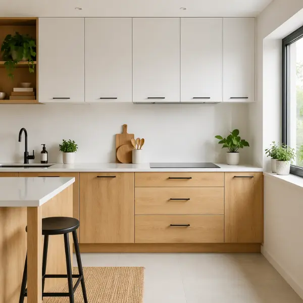
1. White Upper Cabinets + Natural Wood Base Cabinets
This is the combination I recommend most often to beginners, and there is a very good reason for that. White on top keeps the kitchen feeling open and bright, while natural wood below brings in warmth and texture. It never looks boring, it never goes out of style, and it works in almost any home from a compact apartment kitchen to a large family space.
Why It Works
White reflects light and makes a room feel larger. Natural wood balances that brightness with warmth so the kitchen does not feel cold or clinical. Together they hit a sweet spot between clean and cozy.
Best For
Small kitchens where you want to maximize the feeling of space. Also great for open-plan homes where the kitchen flows into the living area.
Styling Tips
Use white quartz countertops to keep the top half clean and consistent. Add matte black cabinet handles to give it a modern edge. A small potted plant or two on the counter brings in life and ties beautifully into the natural wood tones.
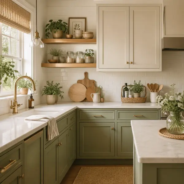
2. Soft Cream Uppers + Sage Green Lowers
This combination feels like it belongs in a cottage or a farmhouse kitchen, but it also translates really well into modern homes when you keep everything else simple. Cream is softer than pure white and gives the upper cabinets a gentle, warm glow. Sage green on the lower cabinets adds an earthy, nature-inspired calm that is genuinely soothing to be around.
Why It Works
Neither color is loud or demanding. They sit beside each other in a way that feels quiet and harmonious. The contrast is there, but it is soft and easy on the eyes. This is a kitchen that will make you want to spend time in it.
Best For
Family kitchens where people gather and linger. Also perfect for homes with a cozy or cottagecore aesthetic.
Styling Tips
Brass or gold cabinet handles are the finishing touch that pulls this combination together. Add open wooden shelves above the countertop for extra warmth. Linen curtains or a woven rug nearby will keep that calm, organic feel going throughout the space.
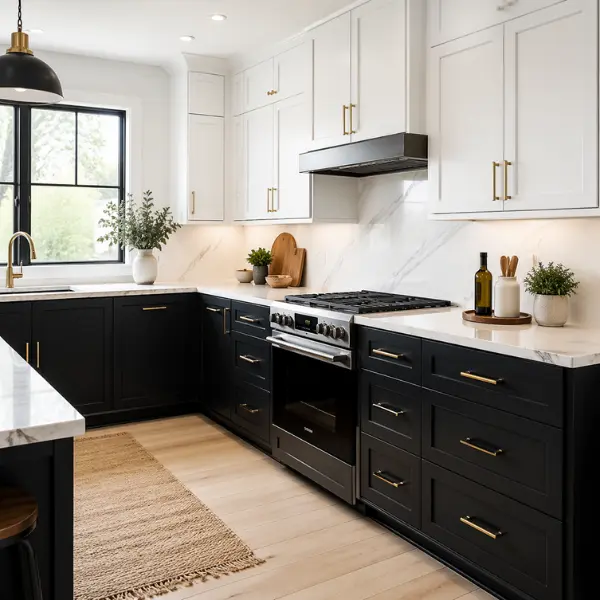
3. Matte Black Lowers + White Uppers
This is for the person who wants their kitchen to make a statement. Matte black is bold, confident, and incredibly stylish when it is done right. Paired with white uppers, it avoids feeling heavy or cave-like. The white keeps the top of the room open while the black anchors the bottom with real presence.
Why It Works
The contrast here is strong and deliberate. It draws a clear visual line between the two halves of the kitchen, which actually makes the whole space feel more structured and intentional. It reads as modern without trying too hard.
Best For
Modern apartments and kitchens that get good natural light. If your kitchen is on the darker side, this combination can still work but you will want to make sure your lighting is excellent.
Styling Tips
Marble or light grey countertops look stunning against matte black cabinets. Gold or brass handles add luxury without competing with the drama. Keep the backsplash simple, white subway tiles or a clean light grout, so the cabinets remain the star.
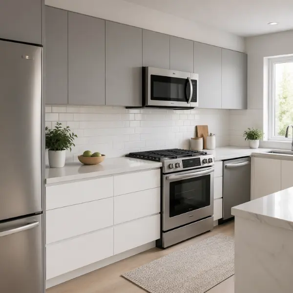
4. Grey Uppers + White Base Cabinets
This is the reverse of the more common setup and it is subtly surprising in the best way. Most people put their darker color below and their lighter color above. Flipping that script with grey on top and white below creates an unexpected softness. The upper cabinets feel framed rather than hovering, and the white base keeps the kitchen grounded and clean.
Why It Works
Grey is a neutral that never clashes. It adds color and depth without committing to anything bold. With white below, the room stays bright and the contrast remains gentle enough for anyone who wants two tones but feels nervous about going too dramatic.
Best For
Minimalist kitchens and anyone who wants a two-tone look that is barely-there but still noticeable. Great for small spaces where you need light but want more than just all-white.
Styling Tips
Stainless steel appliances complement this palette really well because they pick up the grey tones. Keep hardware simple, brushed nickel or chrome works perfectly. Avoid adding too many colors elsewhere, let the cabinets do all the talking.
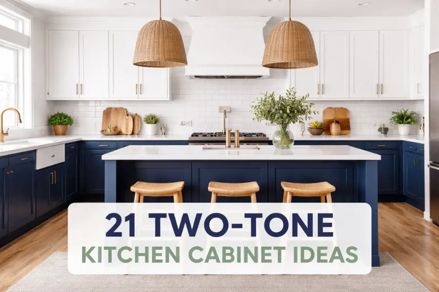
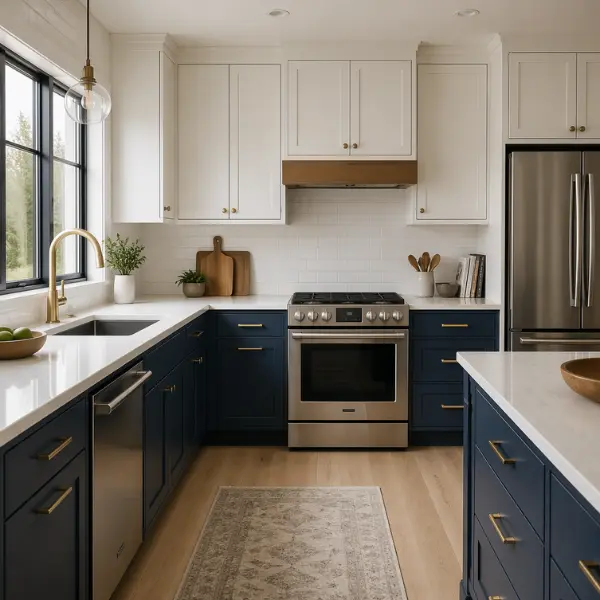
5. Navy Blue Base Cabinets + White Uppers
Navy blue is one of those colors that has an almost magical ability to feel both timeless and current at the same time. It is deep enough to add real drama to the lower cabinets without making the kitchen feel dark. White uppers lift the space and keep everything feeling fresh. This combination has been popular for a few years now and I do not see it going anywhere.
Why It Works
Navy is a grounding color. It anchors the lower half of the kitchen in a way that feels strong and elegant. The white above it creates balance and prevents the room from feeling heavy. Together they feel like a classic combination, like a navy blazer and a crisp white shirt.
Best For
Medium to large kitchens where you have the room to let navy breathe. It also works beautifully in homes with a coastal or nautical feel.
Styling Tips
Brass hardware is the single best upgrade you can make to this combination. It adds warmth to the cool navy and looks expensive without a huge price tag. Light wood flooring or a warm-toned rug will prevent the floor from feeling too cold and dark.
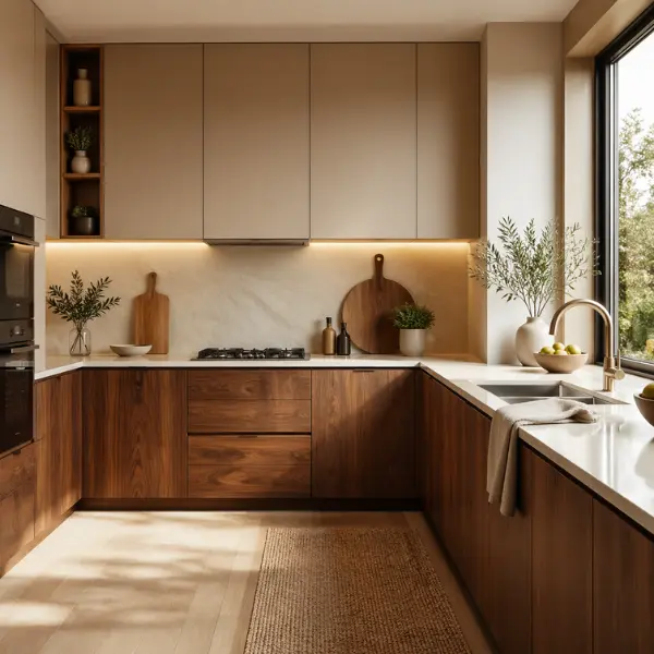
6. Beige Uppers + Walnut Wood Lowers
This is a very grown-up and sophisticated combination. Beige is one of those colors that people sometimes overlook because it sounds plain, but paired with rich walnut wood below it becomes something genuinely luxurious. The warmth of walnut wood against the quietness of beige creates a kitchen that feels both high-end and incredibly livable.
Why It Works
Warm tones have a way of making a space feel welcoming without any effort. Beige and walnut are both in the warm family so they work together naturally. There is no tension between them, just a sense of richness and depth that builds across the kitchen.
Best For
Large kitchens that benefit from the visual weight of walnut. Homes that already have warm wood tones in the floors or nearby furniture will see this combination tie everything together beautifully.
Styling Tips
Stone countertops, whether real or engineered, elevate this combination to another level. Think warm beige granite or a soft travertine. Warm pendant lighting above the island or counter will bring out the depth in the walnut even more.
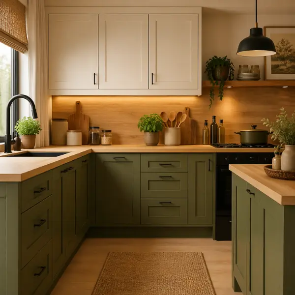
7. Olive Green Lowers + Warm White Uppers
Olive green is having a real moment in interior design right now, and honestly it deserves every bit of attention it is getting. It is a color that feels very grown-up and earthy without being heavy or trendy in a way that will date quickly. Against warm white uppers, it has a very organic, almost Mediterranean quality that is really appealing.
Why It Works
Olive is a muted, complex color. It is not quite yellow, not quite green, and it has a depth that flat colors simply do not have. Warm white uppers sit softly beside it without creating a harsh contrast. The result is a kitchen that feels grounded, natural, and considered.
Best For
Homes with rustic, natural, or boho interiors. It also works in modern farmhouse kitchens where the goal is warmth with clean lines.
Styling Tips
Matte black handles suit olive green really well. Avoid anything shiny or chrome which can clash with the earthiness of the color. Add wooden cutting boards, woven baskets, or ceramic bowls on the counter to reinforce the natural, handcrafted feeling.
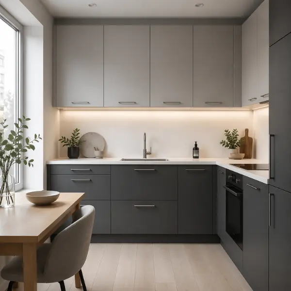
8. Charcoal Grey Lowers + Light Grey Uppers
This is a monochrome approach that is easy to get wrong but incredibly beautiful when you get it right. The trick is making sure the two greys are clearly different enough that the eye can see the distinction. Charcoal below gives the kitchen real depth and weight, while light grey above keeps it from feeling too dark. The overall effect is smooth, modern, and sophisticated.
Why It Works
Working within the same color family creates a sense of cohesion and calm. There is no color clash, no tension. The subtle shift from light to dark gives the kitchen dimension without any drama. It is a quiet kind of elegance that wears very well over time.
Best For
Modern apartments and city kitchens where the aesthetic leans minimal and polished. It suits people who love a calm, neutral space that still has personality.
Styling Tips
White countertops add necessary contrast and prevent the whole kitchen from blending together into one grey mass. Simple metal handles in brushed steel or matte chrome keep the look clean. Good lighting is essential here because grey can absorb light quickly.
9. Dusty Blue Base Cabinets + White Uppers
Dusty blue is one of the softest and most lovely colors you can bring into a kitchen. It is not the bright, saturated blue of a feature wall. It is muted, chalky, and gentle in a way that feels very peaceful. Against white uppers it creates a light, airy kitchen that feels almost like being in a coastal cottage even if you live nowhere near the sea.
Why It Works
Dusty blue has just enough color to add character and personality without overwhelming the space. It is approachable and warm rather than cold and stark. White keeps everything feeling open and clean above it.
Best For
Coastal homes and modern relaxed interiors. It also works beautifully in kitchens connected to outdoor spaces, patios, or gardens because it echoes the colors of sky and water.
Styling Tips
Light wood bar stools at a kitchen island carry the warm neutrals through the space. A white tile backsplash keeps the upper half of the kitchen consistent and simple. Woven or rattan accents add texture and lean into the coastal feel.
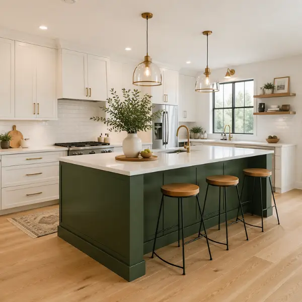
10. Forest Green Island + White Cabinets
This is the two-tone approach where you do not split the upper and lower cabinets at all. Instead, you keep your main perimeter cabinets all one color, in this case white, and make your kitchen island the statement piece in a rich forest green. It is a very clever way to add a two-tone dynamic without it feeling like a dramatic commitment.
Why It Works
The island becomes the visual anchor of the whole kitchen. Everything else around it is clean and simple, which means the green island gets all the attention it deserves. It is a bold but controlled design choice that looks intentional rather than chaotic.
Best For
Open kitchens with a kitchen island where the layout already draws the eye to the center of the room.
Styling Tips
Pendant lighting above the island is essential here. It frames the green island and makes it feel even more like a deliberate design feature. Brass or gold hardware on the island, distinct from whatever you use on the perimeter cabinets, reinforces its identity as a separate piece.
11. Black Island + Natural Wood Cabinets
This is a bold and beautiful reversal of expectations. Natural wood cabinets have a softness and warmth that most people love but sometimes find a little too gentle on their own. Adding a black island cuts through all that warmth with sharp modern contrast and creates a kitchen that feels both organic and striking at the same time.
Why It Works
Wood and black are a natural pairing that appears in furniture design all the time because it simply works. The black island grounds the space and gives it a modern edge while the wood surrounding it prevents things from feeling cold or industrial.
Best For
Large kitchens with open layouts where there is enough room for the island to be its own moment. Homes with industrial or contemporary interiors will love this look.
Styling Tips
Warm pendant lighting above the island pulls out the warmth in the wood and softens the black. Stone countertops in a dark or speckled finish work beautifully on the island itself. Use the same hardware finish throughout to keep everything cohesive.
12. White Uppers + Light Oak Lowers
Scandinavian-inspired kitchens have been enormously popular for good reason. They are bright, calm, clean, and feel inherently organized. White uppers with light oak lowers is a perfect expression of that aesthetic. The oak adds warmth and texture without being heavy, and the white keeps the room feeling spacious and uncluttered.
Why It Works
Light tones throughout the kitchen make it feel larger and fresher than it actually is. Light oak has a beautiful grain that adds visual interest at eye level below the counter while white above stays completely calm and undemanding.
Best For
Small kitchens that need all the visual help they can get. Also suits minimalist households where a clean, serene environment is the priority.
Styling Tips
Keep the decor extremely minimal. A few simple ceramic bowls, a wooden utensil holder, and one or two plants. Avoid clutter because the beauty of this combination is its simplicity and anything extra will undermine it quickly.
13. Cream Cabinets + Terracotta Base Units
This combination is genuinely unique and much more livable than it might sound when you first read it. Terracotta is a warm, earthy orange-brown that connects beautifully with cream. Together they create a kitchen that feels warm, handcrafted, and full of character. It is the kind of kitchen you see in a well-traveled home.
Why It Works
Earth tones are inherently harmonious because they all come from the same family of warm, natural colors. Terracotta and cream do not fight each other, they simply layer in a way that feels deeply comforting and grounded.
Best For
Rustic kitchens, boho-inspired homes, and anyone who loves warm Mediterranean or Moroccan-influenced interiors.
Styling Tips
Handmade ceramic tiles for the backsplash are the perfect complement to this combination. Think a zellige tile in cream or a terracotta tone. Wooden decor items, clay pots, woven baskets, and copper or bronze hardware will all reinforce the handcrafted, artisan quality of this kitchen.
14. Two Shades of Green (Sage + Olive)
Using two shades of the same color might sound like it would be hard to notice, but when you put sage green against olive green the depth is genuinely beautiful. It is a layered, nature-inspired look that has more personality than a single green throughout but none of the tension that comes from using two completely different colors.
Why It Works
Staying within the same color family guarantees harmony. The contrast comes from tone and saturation rather than color itself, which creates a sophisticated depth that is very hard to achieve otherwise. It feels deliberate and mature.
Best For
Nature-inspired kitchens and anyone who loves green but cannot decide which shade to commit to. The answer here is simply both.
Styling Tips
Indoor plants are an obvious choice here and they look incredible against green cabinets. Natural wood floating shelves are perfect for adding another organic material into the mix. Keep the countertops and backsplash neutral, white, cream, or light stone so the greens remain the focus.
15. White Cabinets + Dark Espresso Island
Dark espresso wood has a richness and depth that is hard to achieve with paint. It looks expensive and warm at the same time. Against all-white perimeter cabinets the espresso island becomes a genuine focal point that anchors the entire kitchen. This is a very elegant and timeless two-tone approach.
Why It Works
White cabinets are the perfect backdrop for a statement island because they do not compete. The contrast between the two is strong but warm rather than cold, thanks to the wood tones in the espresso finish.
Best For
Medium to large kitchens where the island is a central feature of the layout.
Styling Tips
Pendant lighting above the island is non-negotiable for this look. It frames the island and brings out the warmth in the espresso finish. Use bar stools in a complementary warm tone, natural leather, warm wood, or even a soft cream fabric.
16. Soft Taupe Uppers + Grey Lowers
This is a very calm and restful combination that suits anyone who wants a kitchen that does not shout. Taupe is a warm neutral that sits between beige and grey, which means it blends beautifully with the cooler grey below it. The overall effect is layered and sophisticated without any drama whatsoever.
Why It Works
Neutral tones reduce visual noise, which makes the kitchen feel organized and easy to be in. The shift from warm taupe above to cool grey below is subtle enough that it reads as depth rather than contrast.
Best For
Small and medium kitchens. Also suits anyone going for a calm, spa-like home environment where the kitchen is intended to feel as soothing as the rest of the house.
Styling Tips
Matte finishes on both the cabinets and the hardware prevent any unwanted shine or harshness. Keep the countertops in a soft stone or quartz. The fewer visual distractions the better for this palette.
17. Navy Island + Light Grey Cabinets
Light grey cabinets across the whole perimeter of the kitchen create a soft, neutral backdrop. Then the navy island comes in as a strong, focused point of color that draws the eye immediately. It is a really confident design move that still keeps the overall kitchen feeling calm rather than chaotic.
Why It Works
Having a single bold element against a quiet background is one of the most reliable design principles there is. The navy island gets all the attention it needs because nothing around it is competing for focus. The light grey stays calm and lets it shine.
Best For
Open kitchens where the island is already a physical centerpiece of the layout.
Styling Tips
Gold or brass hardware on the navy island is a classic pairing that looks genuinely luxurious. You can use a simpler hardware finish on the grey perimeter cabinets to let the island stand apart even more clearly.
18. Black Lowers + Wood Uppers
This is the bold reverse of a much more common configuration and it works surprisingly well. Wood upper cabinets are unusual and eye-catching. They bring warmth and texture right at eye level where you can fully appreciate the grain. Black lower cabinets anchor the base of the kitchen with real strength and modern edge.
Why It Works
Most people expect wood below and a lighter color above. Flipping this creates immediate visual interest and makes the kitchen memorable. The warmth of the wood prevents the black from feeling harsh or industrial.
Best For
Industrial-style kitchens and homes with bold, confident interior aesthetics. Loft-style spaces often suit this combination particularly well.
Styling Tips
Warm lighting is essential here. It brings out the beauty of the wood grain above and softens the black below. Use handle-free cabinet doors for an even cleaner, more modern look.
19. White Cabinets + Pastel Pink Island
This is a playful and genuinely charming combination that manages to feel both fun and sophisticated at the same time. The key is the word pastel. This is not a shocking hot pink, it is a soft, dusky, barely-there pink that sits beside white with complete ease. The island becomes a sweet, personal touch in an otherwise clean kitchen.
Why It Works
Soft color adds charm and personality without overwhelming a space. White keeps everything calm and balanced around it, which gives the pink island permission to be the one expressive moment in an otherwise neutral kitchen.
Best For
Creative and modern homes. It also works beautifully in homes with a light, airy, feminine aesthetic or in a space designed to feel joyful and inviting.
Styling Tips
Keep the countertops on the island white or light stone to let the color of the cabinet be the focus. Simple, minimal hardware works best here. Gold or rose gold handles are a very natural choice.
20. Green Uppers + White Lowers
This flips the more common layout and does something really interesting with it. Having color on the upper cabinets and white below creates a top-heavy look that sounds strange but actually draws the eye upward in a way that makes ceilings feel higher. It is an unusual choice that immediately makes a kitchen look like it was designed rather than just furnished.
Why It Works
The unexpected layout creates visual interest from the moment you walk in. Green sits beautifully at the top of the room against the ceiling, and white below keeps the lower kitchen feeling light and clean. It genuinely feels like a more artistic approach to cabinet design.
Best For
Modern and artistic kitchens. Homes with strong design personalities and owners who enjoy making unexpected choices.
Styling Tips
Keep the backsplash and the hardware simple and clean. A white or very light backsplash will bridge the gap between the green uppers and the white lowers naturally. Minimal open shelving in the upper zone would look incredible here too.
21. Mixed Wood Tones + White Accents
Using two different wood finishes together used to be considered a design mistake. Now it is a deliberate and much-loved approach. Pairing lighter and darker wood tones across different cabinet sections adds richness and texture that a single wood finish simply cannot achieve. White accents, whether on trim, open shelves, or specific cabinet doors, break up the heaviness and add freshness.
Why It Works
Texture mixing creates depth and warmth in a way that paint never can. Natural materials always work well together because they share organic qualities even when they are technically different. White accents act as a visual breather that keeps the space from feeling too dense or dark.
Best For
Large kitchens with a natural or Japandi-inspired design theme. Homes with wood floors and wood furniture will find that mixed wood cabinets tie the whole space together beautifully.
Styling Tips
Soft, warm lighting is critical here to bring out the depth in each wood tone. Stone countertops in a natural finish, think warm quartzite or a subtly veined marble, complement mixed woods perfectly.
Mistakes to Avoid in Two-Tone Kitchens
The concept is simple but there are a few places where people go wrong, and I want to save you from making those same mistakes before you commit to anything.
The biggest mistake I see is using more than two main colors. Two tones means two. The moment you introduce a third color, the design starts to feel scattered and unresolved. Pick your two and stick to them throughout.
Another common mistake is putting two bold or saturated colors together. Bold colors need a neutral partner. Navy needs white. Forest green needs cream. Matte black needs white. If both colors are fighting for attention, neither one wins and the kitchen just feels chaotic.
Ignoring balance between light and dark is also a problem. If both tones are very dark, the kitchen will feel heavy and closed-in. If both are very light, the two-tone effect will barely register. You want one clearly lighter and one clearly darker element for the design to do its job properly.
Finally, do not overlook the effect of natural light on your chosen colors. Colors look completely different in bright daylight versus artificial evening light. Always check paint samples at different times of day before you commit, and consider how much natural light your kitchen actually gets before you decide how bold to go.
Conclusion
Two-tone kitchen cabinets are one of those rare design ideas that look like a lot but are actually very approachable when you understand the principles behind them. The goal is always balance. Light and dark, warm and cool, bold and neutral. When you get that balance right, the result is a kitchen that feels layered, intentional, and completely your own.
If you are just starting out and feeling nervous about the whole thing, start with one of the safest combinations on this list. White and natural wood, or white and navy, are both timeless choices that will look beautiful in almost any kitchen. Once you have lived with a two-tone kitchen for a while you will start to see exactly how the light and space interact, and that knowledge will give you real confidence to try something bolder down the line.
The best kitchen is not the most complicated one. It is the one you love being in every single day.
FAQs
Are two-tone kitchen cabinets still in style?
Absolutely yes. Two-tone cabinets have moved well beyond being a trend. They are now a considered design choice that sits comfortably across modern, traditional, and transitional kitchen styles. They feel current without being fleeting.
What is the best color combination for small kitchens?
White with light wood or white with soft grey are the safest choices for small kitchens because both combinations maximize the feeling of space and light. Avoid pairing two dark tones in a small kitchen as it will make the room feel much smaller than it is.
Can I mix bold colors in a two-tone kitchen?
You can use one bold color but the second should always be a neutral. One bold color plus one neutral gives you drama with balance. Two bold colors next to each other creates visual tension that most kitchens cannot carry comfortably.
Do two-tone kitchens increase home value?
Generally yes. A kitchen that looks thoughtfully designed adds perceived value to a home because buyers see less work to do. A well-executed two-tone kitchen reads as modern and updated, which is always a positive signal to anyone viewing the property.
What is the safest two-tone combination?
White upper cabinets with natural wood base cabinets. It is the single most universally flattering combination available. It works in every size of kitchen, suits every home style, and has been a consistent favorite among interior designers for years with no sign of changing.