

26 Bedroom Paint Color Ideas That Will Completely Transform Your Space
If there is one single change you can make to your bedroom that delivers the biggest visual impact for the least amount of money, it is a fresh coat of paint. I have helped transform dozens of bedrooms over the years, and every single time, the paint color was the decision that made or broke the whole room. Pick the right shade and your bedroom suddenly feels like a boutique hotel. Pick the wrong one, and even the most expensive furniture looks off.
The good news? You do not have to be an interior designer to get it right. You just need the right guidance — and that is exactly what this article is here for.
I have put together 26 bedroom paint color ideas that cover every style, every room size, and every personality. Whether you want something soft and dreamy, warm and cozy, bold and dramatic, or clean and modern — there is an idea here for you. Each one is completely different, fully realistic to pull off at home, and backed by what is actually trending and working in real bedrooms right now.
Table of Contents
26 Bedroom Paint Color Ideas (Core Section)
Here are the top 26 ideas:
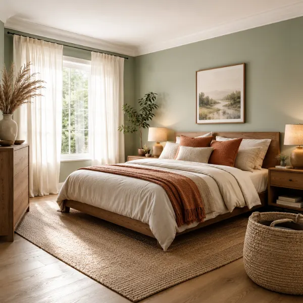
1. Soft Sage Green
Soft sage green is one of those colors that just makes a bedroom feel like a breath of fresh air. It is not too bright, not too dark — it sits right in the middle and makes the whole room feel calm, grounded, and genuinely peaceful. This shade has exploded in popularity because it brings that outdoorsy, natural feel inside without making your walls look like a jungle.
Why It Works
Green is scientifically linked to feelings of calm and restoration. Sage in particular has enough gray in it to feel sophisticated rather than playful, which means it works in adult bedrooms just as well as it does in kids’ rooms. It also plays beautifully with natural light — in the morning it looks fresh, and in the evening it turns warm and cozy.
Best For
Small to medium bedrooms. It is especially great for rooms that do not get a ton of natural light because it brightens the space without feeling stark or harsh.
Styling Tips
- Pair sage walls with warm white trim and linen bedding for a serene, spa-like feel
- Add wooden furniture (oak or walnut tones) to enhance the earthy vibe
- Throw in terracotta or rust-colored cushions as accents — they contrast beautifully with sage
- Avoid cool grays or silver accents; they fight against the warmth of this shade
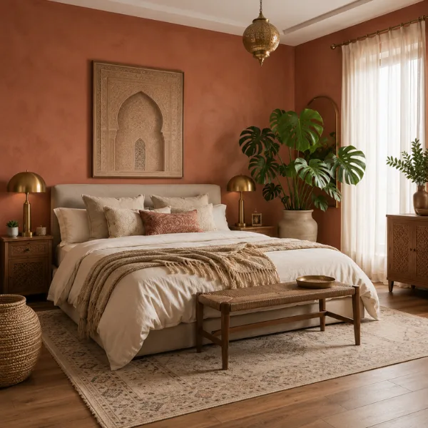
2. Dusty Terracotta
Terracotta is having a serious moment right now — and for very good reason. This warm, earthy, clay-toned color wraps a bedroom in a cozy glow that feels incredibly inviting. Think of it like a sunset on your walls. Dusty terracotta (as opposed to bright orange-red terracotta) is the more refined version that works in modern homes.
Why It Works
It brings warmth without the aggression of a true red or orange. Dusty terracotta has enough brown and gray in it to feel grounded. It gives even a plain, boxy bedroom a rich, layered look. It also photographs beautifully, which is why you see it constantly on Pinterest and Instagram home accounts.
Best For
Master bedrooms and larger rooms where you want richness and depth. Also works incredibly well in rooms with wooden flooring or exposed brick.
Styling Tips
- Combine with cream bedding and woven throws for a Moroccan-inspired, bohemian feel
- Use matte finish only — terracotta looks so much better without shine
- Add plants with big green leaves (like monstera) to create a stunning color contrast
- Brass or gold light fixtures and hardware will elevate this color dramatically
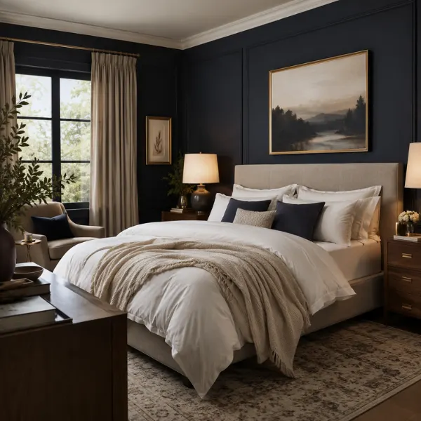
3. Moody Navy Blue
A deep, full navy blue bedroom sounds intimidating, but when done right, it is one of the most stunning looks you can create. It feels like sleeping inside a luxury cabin or a high-end boutique hotel. The key is committing fully rather than playing it safe.
Why It Works
Dark colors create an enveloping, cocoon-like feeling that is actually very conducive to sleep. Navy specifically feels sophisticated, timeless, and rich without feeling cold or sterile. It also works in almost any architectural style — traditional, modern, or transitional.
Best For
Medium to large bedrooms with decent natural light or good artificial lighting. Also works brilliantly in attic bedrooms with sloped ceilings, where the dark color unifies awkward angles.
Styling Tips
- Always use warm-spectrum light bulbs (around 2700K) — they pull the warmth out of the navy and keep it from feeling like a basement
- Pair with brass or gold hardware and fixtures for a luxurious contrast
- Use bright white or cream bedding to stop the room from feeling too heavy
- Benjamin Moore’s Hale Navy is a go-to choice for a slightly softer take on this look
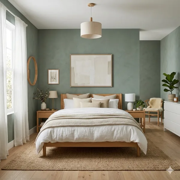
4. Warm Eucalyptus
Warm eucalyptus is a soft, muted green with a gentle gray undertone that feels both fresh and cozy at the same time. Think of it as sage green’s calmer, more mature sibling. It was named Valspar’s Color of the Year for 2026, and it is easy to see why — it hits the sweet spot between nature-inspired and contemporary.
Why It Works
It has just enough warmth to prevent that cold, clinical feeling that some greens can give off. The gray undertone keeps it from being too “outdoorsy,” which means it blends effortlessly into modern and Scandinavian-style interiors. It is restorative without being loud.
Best For
Any bedroom size. It is one of the most versatile shades on this list because it adapts beautifully to both small and large spaces. Perfect for minimalist or Scandinavian-style interiors.
Styling Tips
- Pair with natural wood furniture and white linen for a clean, airy Scandinavian look
- Layer in soft cream and sand-toned textiles for extra warmth
- Add a jute rug and woven baskets to complete the organic, nature-forward vibe
- Works beautifully on all four walls, not just as an accent
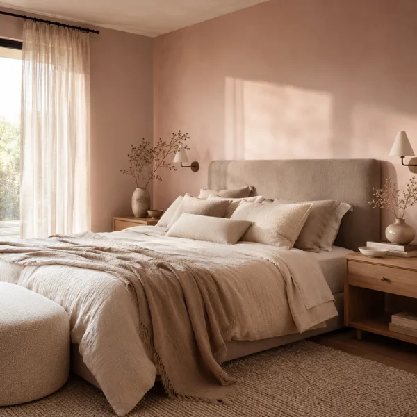
5. Pale Blush Pink
Pale blush is not your childhood bubblegum pink. This is a soft, barely-there, grown-up pink that leans almost toward a warm beige when the light changes. It is one of the most romantic and welcoming colors you can put in a bedroom, and it works across every age group.
Why It Works
Blush creates a softness and warmth that very few other colors can replicate. It makes a room feel cozy and intimate without any drama. It is also incredibly versatile — it looks modern with minimalist furniture and timeless with vintage or collected pieces.
Best For
Guest bedrooms, smaller bedrooms, and rooms where you want softness and warmth without committing to a bold statement. Also great for primary bedrooms with a romantic, minimal vibe.
Styling Tips
- Pair with cream, ivory, or white bedding — avoid pure bright white, which can make blush look washed out
- Keep metallic accents minimal; too much gold or rose gold tips the whole palette into saccharine territory
- Add a linen headboard in a complementary mushroom or warm taupe tone
- Benjamin Moore’s Venetian Portico is a perfect real-world example of this shade done right
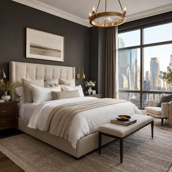
6. Charcoal Gray
Charcoal gray is sophisticated, dramatic, and surprisingly cozy when executed correctly. It is a favorite among interior designers because it creates an instant sense of depth and maturity. Unlike cool grays that can feel cold and corporate, charcoal leans warm and enveloping.
Why It Works
It creates a strong backdrop that makes all other elements in the room — bedding, furniture, artwork — pop with incredible clarity. It also gives a bedroom that high-end, boutique hotel quality that people pay serious money to sleep in.
Best For
Modern master bedrooms in rooms with good natural light. Also works brilliantly in urban settings or rooms with a city view where you want the interior to complement the drama outside.
Styling Tips
- Pair with crisp white trim — the contrast makes architectural details like baseboards and crown molding look intentional and sharp
- Use soft white or cream bedding to keep the room from feeling too heavy
- Add warm wood accents and brass fixtures to bring the temperature up
- Sherwin Williams’ Iron Ore is a widely recommended charcoal that reads refined rather than heavy
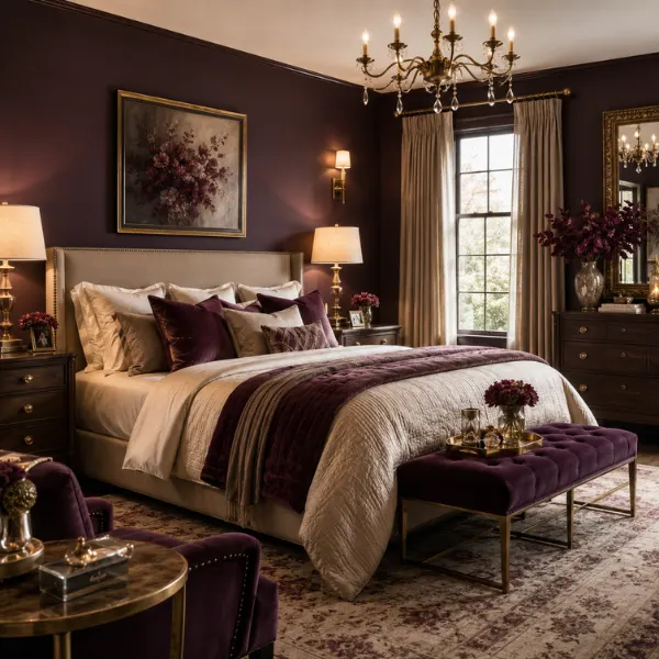
7. Deep Plum
Deep plum sits somewhere between a rich purple and a warm brown, and that is exactly what makes it so interesting. It is unexpected, luxurious, and genuinely unique — you rarely walk into a bedroom painted deep plum, which means it has a powerful “wow factor” built right in.
Why It Works
Plum is a color that wraps a room in richness and intimacy. It reads dramatic but grounded — far more sophisticated than a bright purple. In the right light, it almost looks like a dark wine or a warm brown, which gives it a beautiful, shifting quality throughout the day.
Best For
Larger primary bedrooms where you want a bold, luxurious statement. Also works as an accent wall in smaller rooms if full coverage feels like too much.
Styling Tips
- Pair with gold or antique brass accents for a maximalist, jewel-box effect
- Use velvet or satin textures in bedding to play up the richness of the color
- Balance with cream or warm ivory on other walls if using as an accent
- Avoid cool silver or chrome hardware — it fights against plum’s warmth
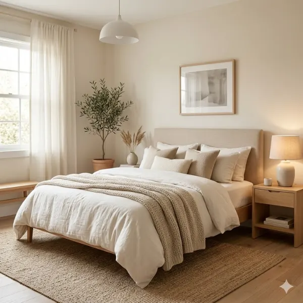
8. Creamy Off-White
Creamy off-white is the sophisticated answer to plain white. Where stark white can feel clinical and cold, creamy off-white feels warm, clean, and inviting all at once. Pantone named a serene off-white (Cloud Dancer) as its 2026 Color of the Year, which tells you everything you need to know about where this color is heading.
Why It Works
It reflects light beautifully, making any room feel bigger and more open. It also acts as a perfect neutral canvas, meaning you can switch up your bedding, rugs, and accessories any time without repainting. It is endlessly adaptable.
Best For
Small bedrooms, rooms with low ceilings, and any bedroom where you want to feel maximum light and space. Also ideal for rental spaces where you want versatility.
Styling Tips
- Pair with warm wood tones and linen textures to prevent the room from feeling sterile
- Choose warm white trim rather than bright white — it creates a cohesive, tonal look
- Layer different textures (knit throws, woven rugs, velvet cushions) to add depth without adding color
- Avoid stark white furniture and cool grays alongside it — they create a jarring contrast
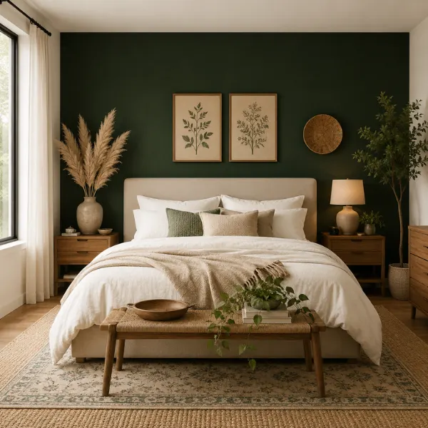
9. Forest Green Accent Wall
A forest green accent wall behind the bed is one of the easiest ways to completely transform a bedroom without committing to a full color change. It is bold, it is fresh, and it creates an instant focal point that makes the whole room look intentionally designed.
Why It Works
An accent wall draws the eye and creates depth and personality in a space. Forest green is especially effective because it is rich and bold enough to stand out, but natural enough to feel calming rather than jarring. It works beautifully with almost any neutral base wall color.
Best For
Bedrooms of any size where you want drama without going all-in. Perfect for renters or anyone who is not ready to commit to full color coverage on all four walls.
Styling Tips
- Use matte finish for the richest, most forest-like quality
- Pair the green wall with white or cream on the remaining three walls
- A floral or botanical rug will tie the nature theme together perfectly
- Hanging dried pampas grass or woven wall art on the green wall adds incredible texture
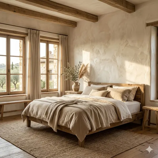
10. Limewash Warm White
Limewash is a paint technique that creates a soft, cloudy, textured effect on walls that looks like a centuries-old Italian farmhouse. When done in a warm white or ivory tone, it is breathtakingly beautiful — organic, layered, and completely unique to your space.
Why It Works
No two limewash walls look the same, which means your bedroom gets a truly one-of-a-kind finish. The texture it creates makes walls look alive — they shift and change with the light throughout the day. It brings soul to a space in a way that flat paint simply cannot.
Best For
Larger bedrooms or primary suites where you want a luxurious, organic, artisan feel. Also beautiful in farmhouse-style or Mediterranean-inspired interiors.
Styling Tips
- Pair with raw wood beams, earthy textiles, and linen curtains for a full organic, rustic look
- Let the texture be the hero — keep furniture and decor simple
- Portola Paints makes an excellent ready-to-use limewash product that DIYers can apply themselves
- Works on all four walls — you do not need an accent wall approach with limewash
11. Patina Blue-Green
Patina Blue (named after the color aged copper takes on) is a moody, complex, blue-green that adds incredible depth to a bedroom. It is Etsy’s 2026 Color of the Year and it is quickly becoming a designer favorite for bedrooms that want something genuinely different from standard blue or green.
Why It Works
It is layered and atmospheric in a way that simple colors are not. Patina blue-green shifts depending on the light — sometimes it reads blue, sometimes green, sometimes almost teal. That shifting quality makes a bedroom feel rich and interesting at every hour of the day.
Best For
Medium to large bedrooms where you want a moody, sophisticated, statement look. Also works brilliantly as a single accent wall in smaller rooms.
Styling Tips
- Pair with warm white bedding and natural wood furniture to balance the depth of the color
- Copper or aged brass accents are a natural match — they literally inspired the color name
- Layer in dark green plants to enhance the organic, elemental feel
- Avoid pairing with cool grays or silver, which flatten this color’s warmth
12. Burnt Orange
Burnt orange is a bold, energizing, and deeply warm choice for a bedroom that wants to break from the norm. It is the very opposite of the cool gray era we are moving away from — rich, sunset-warm, and full of personality.
Why It Works
Burnt orange creates a cozy, intimate feeling similar to being next to a warm fire. It is warm-toned enough to be energizing in the morning and rich enough to feel calming in the evening. It is also one of those colors that looks incredible in both natural and artificial light.
Best For
Larger, well-lit bedrooms with strong enough natural light to handle the richness of this color. Also stunning in bedrooms with Southwestern architectural details like exposed wood beams or arched doorways.
Styling Tips
- Pair with cream, tan, or warm ivory bedding — never cool white or gray
- Natural fiber rugs and terracotta planters will complete the Southwestern warmth
- Keep the ceiling and trim light (warm white) to give the room breathing space
- Use matte finish — any sheen on orange can look painted-on and unnatural
13. Muted Olive
Muted olive is a dark, earthy, yellow-green that feels incredibly rich and grounded. It is not a bright or cheerful color — it is more brooding and complex than that, which gives it a mature, sophisticated quality that works beautifully in adult bedrooms.
Why It Works
Olive connects a bedroom to nature in a very different way than lighter greens do. Where sage feels fresh and airy, olive feels rooted and warm. It creates a sense of depth and layering that makes even a simply furnished room look intentionally styled.
Best For
Medium to large bedrooms with warm natural light. Works beautifully in rooms with dark wood floors, leather furniture, or vintage and mid-century decor.
Styling Tips
- Pair with deep brown wood furniture and leather accents for a rich, earthy feel
- Ochre yellow or mustard cushions make a stunning accent color alongside olive
- Use warm-toned lighting — olive can look murky under cool fluorescent light
- Works incredibly well as a full-room color, not just an accent wall
14. Soft Lavender
Soft lavender is having a full comeback in 2026 — and this time, it is not the pastel purple of a little girl’s room. We are talking about muted, dusty, sophisticated lavender that leans slightly gray and reads almost like a warm neutral in certain lights.
Why It Works
Lavender is genuinely calming. Studies consistently show it lowers anxiety and promotes restful sleep, making it one of the most scientifically sound choices for a bedroom. The muted, dusty version is grown-up and chic, far removed from its sugary reputation.
Best For
Guest bedrooms and smaller spaces. Also beautiful in primary bedrooms where you want something a little unexpected and romantic without going full bold.
Styling Tips
- Pair with warm white and cream bedding — never pure bright white
- Warm wood tones (oak, pine) stop lavender from feeling too feminine or sweet
- Add dried botanicals, eucalyptus, or real lavender in vases for an on-theme, organic touch
- Deep plum or dusty rose accent cushions layer the palette beautifully
15. Warm Greige
Greige — the perfect blend of gray and beige — is the ultimate sophisticated neutral. Not as cold as gray, not as plain as beige, warm greige hits a sweet spot that makes every room look polished and put-together without much effort at all.
Why It Works
It goes with absolutely everything. Warm greige is that rare paint color that can adapt to almost any furniture style, any bedding color, and any lighting condition. It is currently replacing cool gray in homes across the board because it photographs warmer and feels more welcoming to live with day-to-day.
Best For
Any bedroom, any size. It is especially useful in primary bedrooms shared by two people with different style preferences because it pleases almost everyone.
Styling Tips
- Layer warm whites, creams, and taupes in bedding and textiles for a tonal, cocooning feel
- Choose greige with warm (brown or yellow) undertones rather than cool (blue or purple) ones
- Natural textures like linen, jute, and wood feel right at home against this color
- Sherwin Williams’ Accessible Beige and Agreeable Gray are two popular real-world versions
16. Midnight Indigo
Midnight indigo is a deep, dark navy with a purple undertone that makes it feel more complex and dramatic than straight navy. It is the kind of color you would expect to find in a five-star hotel room — deeply intimate, richly layered, and quietly spectacular.
Why It Works
The purple undertone adds warmth and personality that a straight navy lacks. It creates an extraordinary sense of depth on walls, making a bedroom feel like a private, sheltered retreat. In candlelight or warm artificial light, it looks absolutely stunning.
Best For
Larger primary bedrooms or master suites where drama and luxury are the goals. Works particularly well in rooms with high ceilings or interesting architectural details.
Styling Tips
- Use warm-spectrum bulbs exclusively — this color needs warm light to show its best undertones
- Pair with gold, amber, and deep copper accents for a truly luxurious look
- Plush velvet bedding in cream, gold, or warm white adds incredible textural richness
- Keep accessories and decor minimal — the wall color does all the heavy lifting
17. Clay Earth Tone
Clay is a warm, mid-toned, earthy color that sits between terracotta and beige — grounded, natural, and quietly beautiful. It has been rising steadily in the design world because it delivers depth and warmth without the boldness of terracotta or the commitment of a truly dark color.
Why It Works
Clay is endlessly versatile. It has a natural, handmade quality that makes a bedroom feel genuinely lived-in and cozy rather than perfectly staged. It also adapts to different styles with ease — bohemian, Japandi, farmhouse, and modern all look fantastic against a clay backdrop.
Best For
Bedrooms of any size. Clay is one of the most universally flattering paint colors on this list — it works in small rooms without feeling heavy and fills large rooms without getting lost.
Styling Tips
- Pair with creamy white bedding and woven baskets for a natural, organic feel
- Layer in plants with large green leaves to create a beautiful earthy contrast
- Unfinished or raw-edge wood furniture looks particularly stunning against clay walls
- Combine with matte black hardware for a contemporary, grounded edge
18. Dusty Rose
Dusty rose is the more sophisticated, grown-up cousin of blush pink. It has more pigment and more depth than pale blush, but it is still soft and warm rather than bold. Think of it as a muted mauve-pink that leans earthy rather than sweet.
Why It Works
It is feminine without being sugary. Dusty rose has a vintage, romantic quality that works beautifully in bedrooms aiming for a collected, European-inspired feel. Combined with warm neutrals, it feels absolutely timeless.
Best For
Guest bedrooms and primary bedrooms where a soft, romantic, unhurried atmosphere is the goal. Works across all room sizes but truly shines in medium-sized bedrooms.
Styling Tips
- Pair with warm gray, cream, or mushroom bedding to keep the palette grounded
- Antique or vintage furniture pieces look exceptional against dusty rose
- Dried flower arrangements and warm lighting enhance the romantic atmosphere
- Avoid bright white trim — opt for an off-white or warm cream to stay in the same tonal family
19. Slate Blue-Gray
Slate blue-gray is that beautiful in-between color that cannot make up its mind whether it is blue or gray — and that ambiguity is exactly what makes it so interesting. It is cool and calming, but with enough blue in it to feel more intentional than a plain gray.
Why It Works
It has a clean, modern quality that works equally well in contemporary and transitional interiors. Slate is also one of the most restful colors on this list — it has the calm of gray combined with the sleep-promoting qualities of blue.
Best For
Any sized bedroom, but particularly effective in modern or contemporary spaces. Also great for home offices that double as guest bedrooms because it reads professionally during the day and peacefully at night.
Styling Tips
- Pair with bright white bedding for a clean, hotel-like look
- Silver, chrome, or brushed nickel accents match the cool undertone perfectly
- Add a pop of mustard yellow or rust in a throw or cushion to warm up the coolness
- Brynn Olson Design Group recommends serene grey-greens and blues as perfect bedroom palettes
20. Rich Emerald
Rich emerald is a deep, jewel-toned green that brings extraordinary drama and elegance to a bedroom. If you want your bedroom to look like it belongs in an editorial spread, emerald is your color. It is bold, it is lush, and it is completely unforgettable.
Why It Works
Emerald is one of those rare colors that feels both exciting and calming at the same time. The depth of the color is stimulating, but its link to nature keeps the mood grounded. In the right room, an emerald bedroom feels like sleeping inside a forest — which is about as restful as it gets.
Best For
Larger bedrooms where the scale of the room can absorb the richness of the color. Also works brilliantly as a single accent wall in a smaller room where full coverage would overwhelm.
Styling Tips
- Pair with gold or antique brass fixtures for a luxurious, jewel-box feel
- Use white or cream bedding to prevent the room from feeling too dark
- Add an area rug in a warm neutral (camel, sand, ivory) to ground the look
- Works beautifully with dark wood furniture for a fully maximalist, layered bedroom
21. Universal Khaki
Universal Khaki — Sherwin Williams’ pick for its 2026 Color of the Year — is a beige-khaki hybrid that delivers sophisticated earthiness in the most understated way possible. It is warm, grounded, and timelessly neutral.
Why It Works
Khaki sits in that comfortable middle ground between beige and tan, with just enough depth to feel intentional rather than default. It is quietly beautiful — the kind of color that people notice and compliment without being able to immediately pinpoint why the room looks so good.
Best For
Any bedroom, any size. It is a particularly smart choice for primary bedrooms because it provides a long-term liveable backdrop that will not feel dated in five years.
Styling Tips
- Pair with warm whites, deep browns, and caramel leather accents for a classic look
- Layer textures generously — linen, wool, cotton, and wood all look exceptional against khaki
- Add dark green plants for a fresh, earthy contrast that pops beautifully
- Works well alongside natural stone, terracotta, and raw wood in the same space
22. Matte Black with White Trim
A matte black bedroom is the highest-contrast, most daring choice on this entire list — and it is absolutely spectacular when done right. The black walls combined with crisp white trim create a look that is equal parts dramatic and refined.
Why It Works
The contrast between matte black walls and bright white trim turns ordinary architectural features into design statements. Baseboards, door frames, and crown molding suddenly look like intentional design choices rather than builder-grade afterthoughts. The matte finish ensures the look is sophisticated rather than harsh.
Best For
Medium to large bedrooms with strong natural light. This is not for small, dark rooms — but in a well-lit space with great architecture, it is absolutely show-stopping.
Styling Tips
- Commit fully: the combination only works when the trim is crisp, clean, and purely white
- Use soft white or cream bedding as your anchor — the contrast to the black walls is stunning
- Warm lighting is non-negotiable; cold lighting kills this look completely
- Add large mirrors and metallic accents to bounce light around the room
23. Two-Tone Tan and Navy
The two-tone approach — painting opposing walls in different but complementary colors — is one of the most underrated techniques in bedroom design. Tan and navy work together beautifully: the tan brings warmth and the navy delivers depth and personality.
Why It Works
Two-tone color schemes add visual interest and dimension without the commitment of a full bold color. The tan walls feel neutral and grounding while the navy walls feel dramatic and intentional. Together, they create a balanced, layered look that reads as professionally designed.
Best For
Medium-sized bedrooms, especially those with a simple layout. Ideal for homeowners who want something more interesting than a solid neutral but less intense than an all-over bold color.
Styling Tips
- Paint the two walls opposite each other (not adjacent) for the cleanest visual effect
- Use the navy for the headboard wall to create a natural focal point around the bed
- Keep bedding in cream or warm white so it complements both wall colors equally
- Add tan and navy throw cushions to tie the two tones together on the bed
24. Warm Mushroom Neutral
Warm mushroom is the quiet achiever of the neutral world. It is a rich, complex, brownish-gray that feels incredibly sophisticated while being completely unpretentious. It is the color equivalent of a cashmere sweater — understated but unmistakably quality.
Why It Works
Mushroom tones add visual weight and richness to a bedroom without any drama. They are deeply liveable — calming, cozy, and infinitely adaptable. As the design world moves away from cool grays, warm mushroom and greige tones are stepping in as the natural replacement.
Best For
Primary bedrooms, adult guest rooms, and any bedroom where long-term comfort and liveability are the top priorities. Works in any size room because it neither expands nor compresses the perceived space dramatically.
Styling Tips
- Layer warm neutrals on neutrals — cream, ivory, sand, and oat bedding all look beautiful here
- Pair with natural wood furniture in lighter tones (ash, oak) for a fresh Japandi feel
- Warm amber or soft brass lighting brings out the richness of the mushroom tone beautifully
- Avoid cool grays or silver accents — they undermine the warmth of this color
25. Deep Berry (Wineberry)
Deep berry — think the color of a rich red wine or a ripe blackberry — is one of the most dramatic and intimate colors you can bring into a bedroom. It is bold, it is luxurious, and it is completely unlike anything most people have lived with before.
Why It Works
Berry tones create an extraordinary cocoon effect. When you walk into a room with deep berry walls and the lighting is warm, it feels like stepping into a private, sheltered world. The color has a magnetic quality — it pulls your eye in and makes everything it surrounds feel elevated and precious.
Best For
Primary bedrooms and master suites in larger spaces. Best reserved for rooms where you sleep and relax exclusively, rather than dual-purpose rooms, because of the strong mood it creates.
Styling Tips
- Use warm ambient lighting only — overhead bright lighting will make this color feel harsh
- Pair with gold, brass, and warm cream for a maximalist, romantic look
- Deep velvet or silk bedding in ivory or cream creates an extraordinary contrast
- Keep the ceiling light (warm white) to prevent the room from feeling cave-like
26. Color-Drenched Teal (Walls and Ceiling)
Color drenching — painting walls and ceiling in the exact same color — is the boldest and most transformative technique on this list. When that color is a rich, complex teal, the result is genuinely spectacular. The walls and ceiling blur together, creating an immersive, all-enveloping experience that no other technique can replicate.
Why It Works
Color drenching removes the hard line between wall and ceiling, making the room feel intentionally designed at every angle. Teal — a rich mix of blue and green — has both the calming qualities of blue and the restorative energy of green, making it one of the most interesting and mood-supportive choices for a bedroom.
Best For
Medium to large bedrooms where you want a truly bold, editorial, designer statement. Also surprisingly effective in rooms with lower ceilings because the continuous color actually makes the ceiling feel higher rather than lower.
Styling Tips
- Use the exact same paint color and finish on walls AND ceiling — no cheating with a lighter shade on top
- Furnish with natural materials: rattan, linen, wood, and stone to balance the intensity of the color
- Keep bedding simple and light — cream or warm white works best
- Warm globe-style light fixtures (not recessed or fluorescent) complete the enveloping atmosphere perfectly
Mistakes to Avoid When Painting Your Bedroom
Even the best paint color in the world can go wrong if you make one of these common mistakes. Here is what to watch out for before you pick up a brush:
Not testing your color in real light first. Paint looks completely different at 9am than it does at 9pm. Always test a large swatch (at least A4 size) on your actual wall and observe it throughout the day and evening before committing.
Skipping primer. This is especially critical with dark colors like charcoal, navy, and deep berry. Without a proper primer, dark colors streak and require four or five coats. Two coats over a good primer will always look better than five coats without one.
Using the wrong finish. Flat matte is beautiful and sophisticated for walls, but it shows every fingerprint and scuff. In high-touch areas around light switches and doors, use eggshell or satin. For truly dark colors, designers consistently recommend satin for durability.
Painting every wall the same color without variation in your decor. When going bold with a full-room color, you must vary texture in your furnishings — different fabric types, material finishes, and layered accessories — otherwise the room ends up looking flat and one-dimensional.
Choosing the wrong undertone. Every paint color has an undertone that interacts with other colors in the room. A gray that looks perfect on the sample card can turn lavender next to your cool-toned furniture. Always look at undertones and test alongside your existing decor.
Ignoring your lighting situation. Warm light (amber, gold, soft white bulbs) and cool light (daylight or white LED bulbs) transform the same paint color into two completely different experiences. Choose your bulbs before you finalize your paint color, not after.
Rushing the drying time between coats. Paint color is never fully accurate until it is completely dry. What looks too dark or too light mid-application will look entirely different after a full cure. Always wait the full recommended time between coats.
Conclusion
There is truly a perfect bedroom paint color for every style, personality, and room size on this list — and the best part is that changing your paint is one of the most affordable, reversible, and impactful things you can do to transform a space.
Whether you go with the safe but stunning elegance of warm eucalyptus, the dramatic intimacy of moody navy, or the bold confidence of a color-drenched teal ceiling, the right choice is simply the one that makes you feel good every single time you walk into that room.
Do not overthink it. Pick your top three from this list, test them on your wall, live with them for a few days, and trust your gut. Paint is just paint — you can always change it. But when you find the right color, your bedroom will feel like a completely different, deeply personal space that you genuinely love being in.
Now go grab those swatches and get to work.
FAQs
What is the most popular bedroom paint color right now? Soft greens — particularly sage, eucalyptus, and muted olive tones — are the most searched and widely recommended bedroom paint colors going into 2026. They replaced the cool gray era by offering the same versatility with far more warmth and personality.
What paint color makes a small bedroom look bigger? Creamy off-whites, pale blush, soft lavender, and warm greige are the best choices for making small bedrooms feel larger. They reflect light and keep the visual weight of the room low. Avoid very dark colors in truly small rooms unless you have excellent natural light.
What is the most calming color for a bedroom? Soft sage green, slate blue-gray, pale lavender, and warm eucalyptus are consistently rated as the most calming bedroom colors. Green and blue tones in particular have strong scientific backing for promoting relaxation and better sleep quality.
Should I use matte or satin finish in a bedroom? Matte finish is the most popular choice for bedroom walls because it is sophisticated and hides imperfections beautifully. However, for very dark colors (charcoal, navy, deep plum) most designers recommend eggshell or satin for durability and ease of cleaning.
Can I use a dark paint color in a small bedroom? Yes — with the right approach. Use dark colors in small bedrooms with good natural light or strong artificial lighting. Pair dark walls with light bedding and furniture to prevent the space from feeling too heavy. Color drenching (walls and ceiling the same dark color) can actually make low-ceilinged rooms feel taller.
How do I choose between two colors I love? Test both as large swatches on the actual wall. Live with both swatches for at least three days. Observe each one in the morning, afternoon, and evening. Then ask yourself: which one makes me feel more comfortable and at home? Your gut answer on day three is almost always the right one.
How long does it take to paint a bedroom? With proper prep (cleaning walls, taping trim, laying drop cloths), most bedrooms take one full day to paint — including two coats and drying time. Dark colors may require an additional coat the following day. Allow 24–48 hours before moving furniture back.
What is color drenching and should I try it? Color drenching means painting your walls and ceiling in the same color, creating an immersive, all-over look. It works especially well with richer, deeper tones like teal, dusty rose, or forest green. It is a bolder technique but one of the most impactful things you can do to transform a bedroom, and definitely worth trying if you want a truly designer result.